This week’s frugal Friday has been pre-empted by the need to finalize a room plan before the electrician comes next week!
I need to commit to a design so I know where to place the lights, and I’m hoping you’ll look at this and help me see the flaws before it is too late.
Here’s a 36 second video showing the changes.
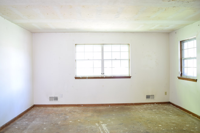
For those who don’t like video, here’s the before photo again. You’ll notice there are vents and electrical to work with. I plan to use this tutorial.

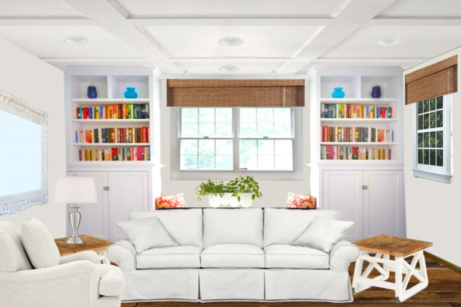
and here’s what it would look like with the flooring paint, coffered ceiling and built ins:

For those who prefer video, I made a little longer one with verbal explanations. The piece behind the sofa is our little piano . It’s about 3 feet in front of the window seat to soak up all the light from the window and make a little sitting area on that side of the room. That should center the larger seating area across from the wide entrance into the room from the foyer. The few here is as if we were standing in the dining room/kitchen looking in.
Darren said if I go with the built ins, I need to make them so they will be removeable with minimal damage and be useful as furniture in another area. My research told me to place recessed lights 3 feet from the corners and then 4-5 feet apart after that…..so would that be from the room corner so if I remove the built ins it still looks ok, or from the corner of the built ins after they are finished? What would you do with the lights?
Angela, this is a great looking room! I love watching you plan and execute these room transformations!
Now I’m a details person, so a rough sketch like this doesn’t always give me a good idea of what to expect from the real room. Right now, this is what I’m seeing . . .
My eye immediately says, The cupboards are too tall. Did you try aligning the bottom bookshelf to the bottom glass of the center window? You could then raise the mirror, so the bottom of its glass is at the same height as the center window glass, creating a common sight line around room.
As this plan stands, you probably don’t want to carry the low molding into the window seat area, especially if you add a thick seat cushion. That could make it uncomfortable to sit there and lean against the walls.
As far as the recessed lighting goes, I would go ahead and place the lights measuring from the walls–without the bookcases. While the bookcases are there you can use them as the more focused lights to show off the items in your open shelves. There are lots of different styles. I’m sure you can find something to fit your style and budget. Looks amazing!!
If you go with the coffered ceiling I would center each ligh within each coffer.
Center based on the wall. The wall is still there, and your eye will realize that and feel centered, especially since there is a window in that way at the wall depth. I feel like that would be the best choice even if you were building permanent bookcases.
Room looks great! A couple of fun things to try on your design board: add X’s to front of cabinet doors, still with white trim. I think that might add a bit more custom feel and look neat with your style of end table. Try a mirror with a wooden frame. I’m not sure I’d like it better, but would be interested to see that, maybe something to match shade of floor/window shades. Try a different colored chair, maybe even something with a print. Looks great as is, though, but I was looking for interested suggestions since you asked. I love how clean it feels.
Angela, These makeovers are so fun! I love watching what you come up with. You definitely have a talent and know what you like. I think the lights should be measured from the wall and not the corner of the bookshelves. Using them as highlights for the bookshelves will serve well and when you move the bookshelves the lights will look centered. I also love the side tables. I have plans to make a similar style for a sofa table in my livingroom.
Hi, can you tell me which photoshop software did you use to make this room please?
Yes, I used the smaller cheaper elements version. I bought it from Costco a few years ago and don’t pay monthly for it.
oh that’s smart, thank you! 🙂