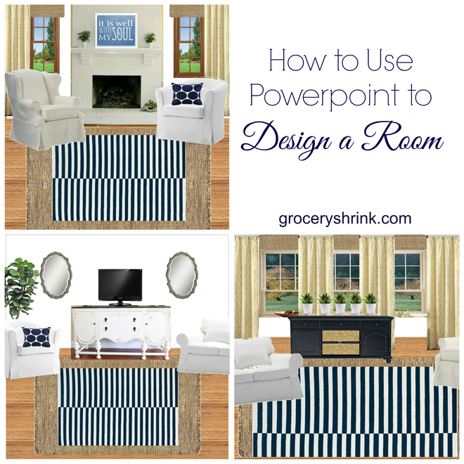
This is so much fun! I made a video to show you how I try out a new design in a room before I break a sweat or spend a dime. I can decide if items work in my space just by trying them virtually without buying anything. If you take a photo of your room straight on, you can drop the items right over your picture so you get all the proportions right.
I use power point because we’ve owned it for years. I have an old version, but newer ones work too. If you have photoshop and know how to use it, please don’t watch my video. It might make you ill. You can watch the last few seconds. It’s fun :).
Here’s a before picture of Stacy’s room:
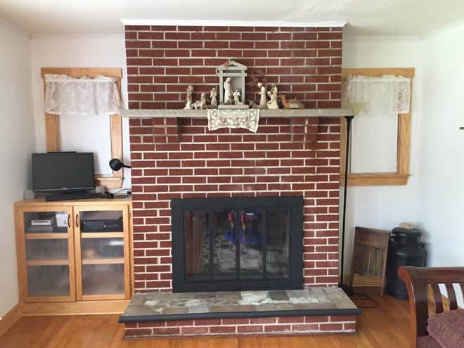
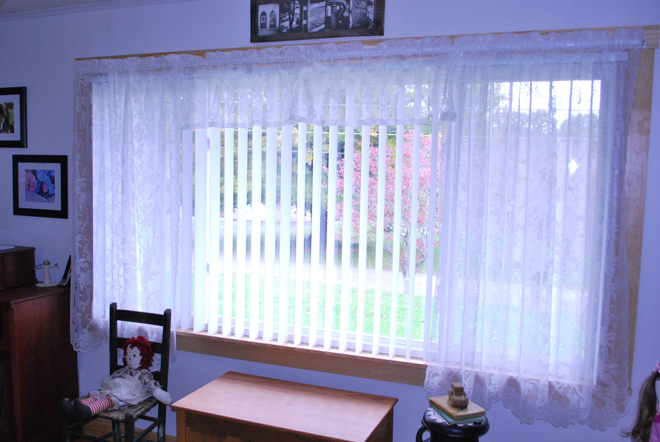
It was the wrong angle to drop pictures right on top, but it gave me enough of a visual of the whole space that I could create new pics for her.
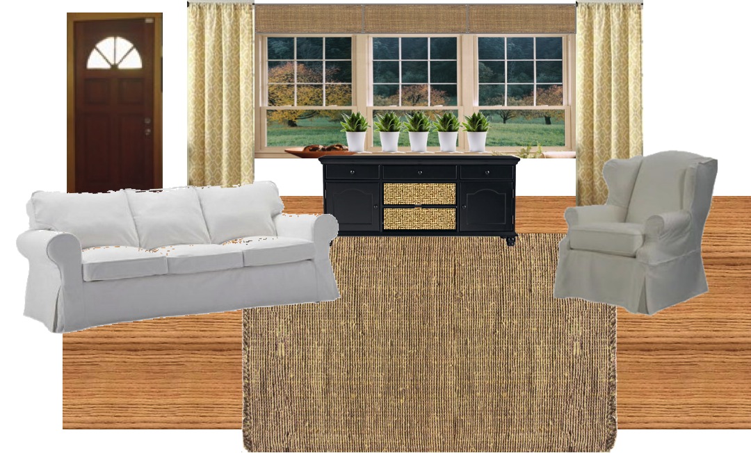
I couldn’t find a sofa at just the right angle, so we’re using our imagination :). The wing chair goes on one side of the fireplace.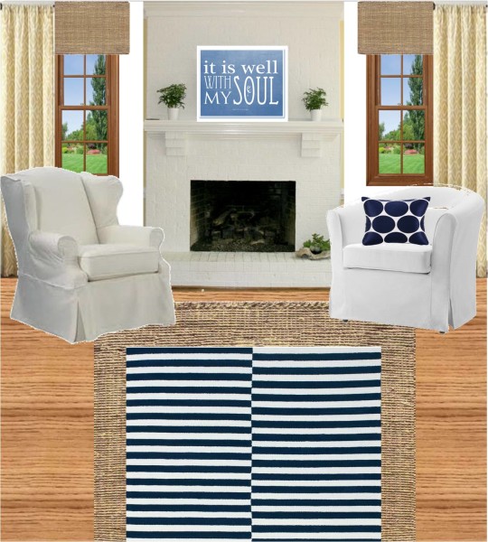
Like this. I tried to use items in the design that she could buy on a budget and that are easy to find. I didn’t include her cabinet under the window, because I have a new plan for her computer, below. This is the wall opposite the big window.
The buffet would be a piece to look for on craigslist and paint out. Her husband hates throw pillows, but I couldn’t resist doing one picture to see what it could look like with some fun pillows.
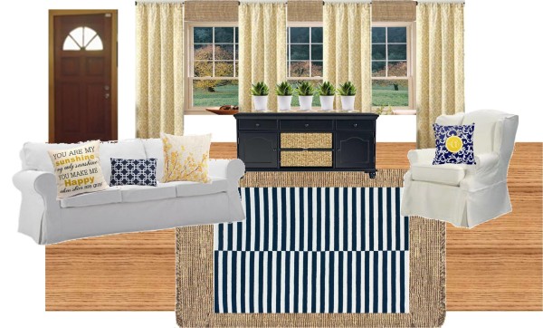
All of these photos were with her current white walls. Just for giggles I wanted to see what it would look like with butter yellow walls:
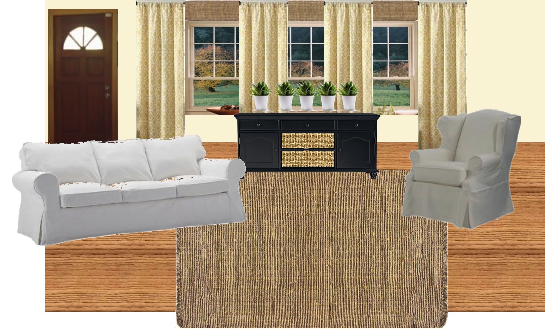
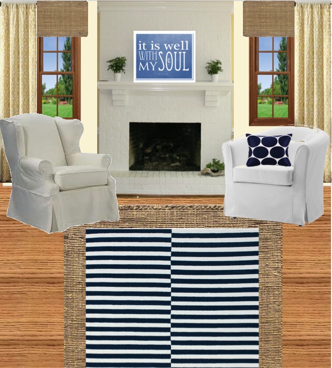
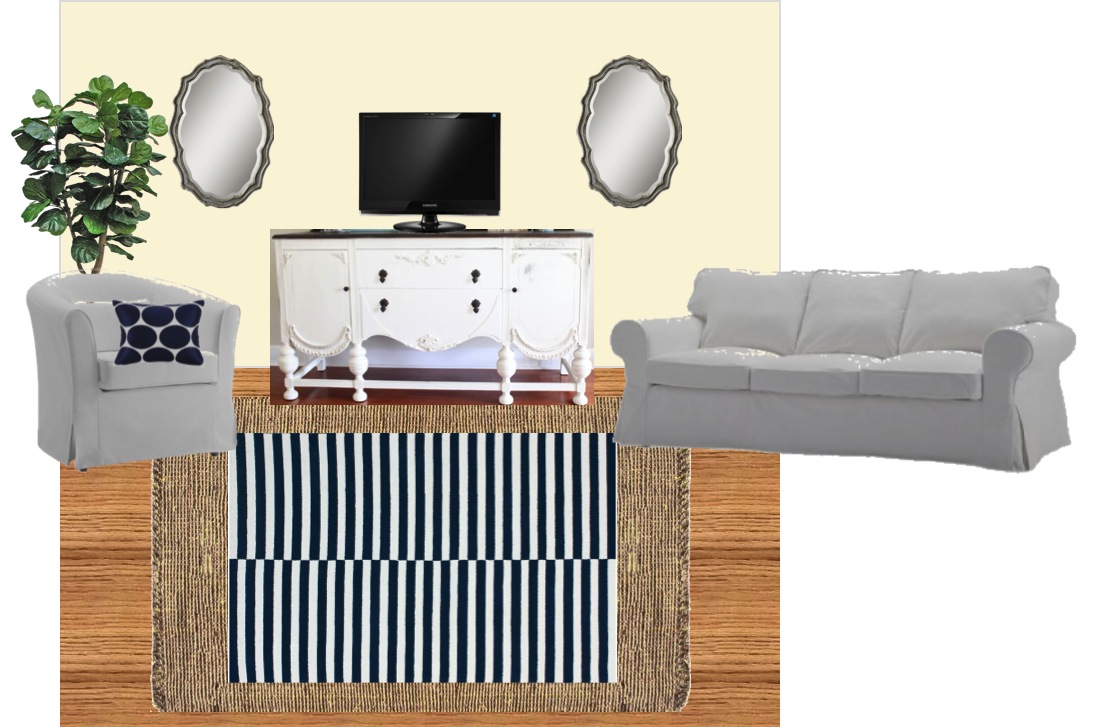
I can’t decide which I like better. Stacy might like the white better….because it’s done. Which do you like?
I also made a series for her without the layered rugs.
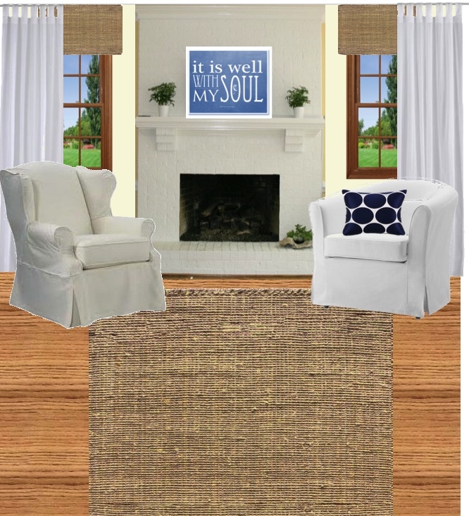
It’s ok to save money on the budget, but I really like the layered rug.
Seriously guys, the last few seconds….That kid makes me really happy.
You can subscribe to my youtube channel here. (Subscribers get sneak peaks of my videos before I blog them.)
line up those stripes on the blue and white rugs….they are making me car sick!
Really? I love that rug. Not everyone’s going to love the same things for sure. I can’t line them up though. It comes that way from the store and I just pulled a product photo for the mock up.
I’m not sure if you’re having a good time, but I’m having a blast! I’m torn on the yellow though – I’m going to give myself time to consider it.
Stacy, if you don’t want to repaint, you can just use yellow in the curtains. If you want more you can add a feature wall opposite the window. Feature walls can make a space feel smaller, so proceed with caution. I think you’d be in good shape though since all the colors are light.
This is so fun! I think it would be good for me to design my rooms like this instead of just winging it :).
It is really fun! It makes me a lot more confident when it’s time to actually spend money.
Just wanted to pop by and let you know that we loved this link so much from last week’s #HomeMattersParty that we featured it this week! Would love for you to come check it out! Happy Friday! http://theroadtodomestication.com/2015/07/17/home-matters-linky-party-46/
How exciting, Kristen! Thank you so much for the feature! 🙂