Andrea wrote to me a few weeks ago: “I need help making my house more attractive, but have almost no budget to do so. I am sure you can relate. I am terrible with colors. My house is dark. So, I’d like to lighten things up. It had all dark trim. I am slowly painting it all white. I have a rather small living room which comes off of a very large eat-in kitchen by a set of French doors. So, I need the colors to flow, since it is visible from the kitchen. I am more of a country girl than a modern girl. My oldest is graduating this year and we are having a cookout here. We were so blessed to be able to homeschool him for his entire schooling. So, I am ready for a party! I really want to spruce things up, but don’t have too much time. It is June 17th!”
Andrea’s home is large and airy and the French doors are really charming. Her whole main floor is butter yellow and it’s such a bright sunny color, I decided to use the same thing in her parlor.
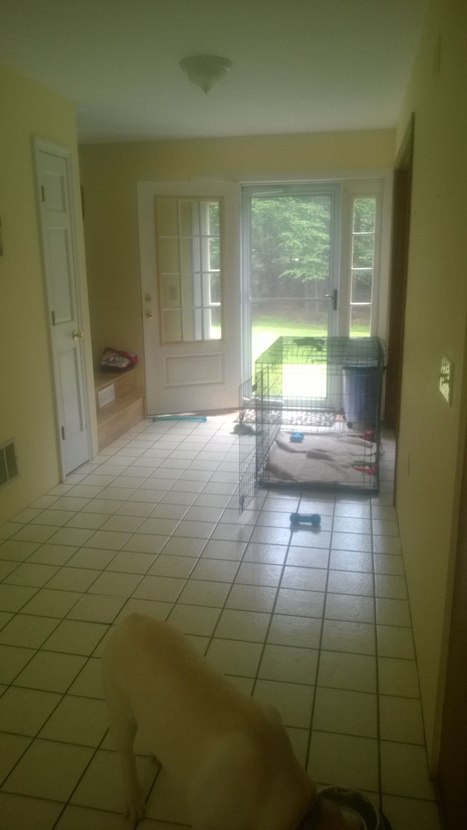
Here is her foyer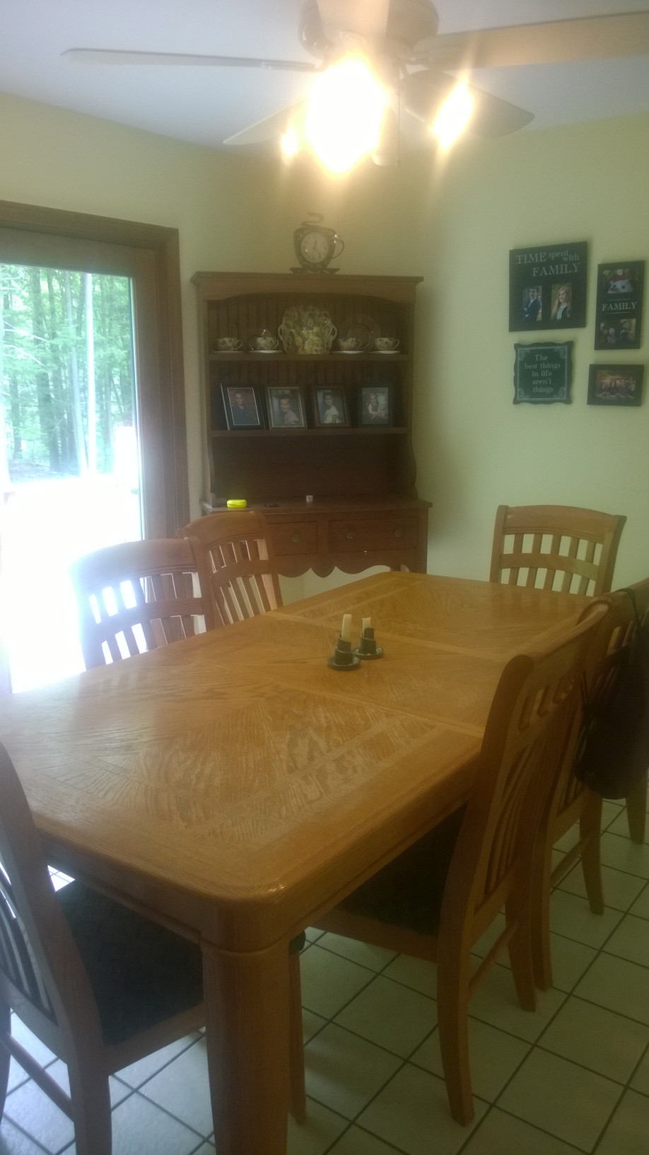
and her dining area with the butter walls.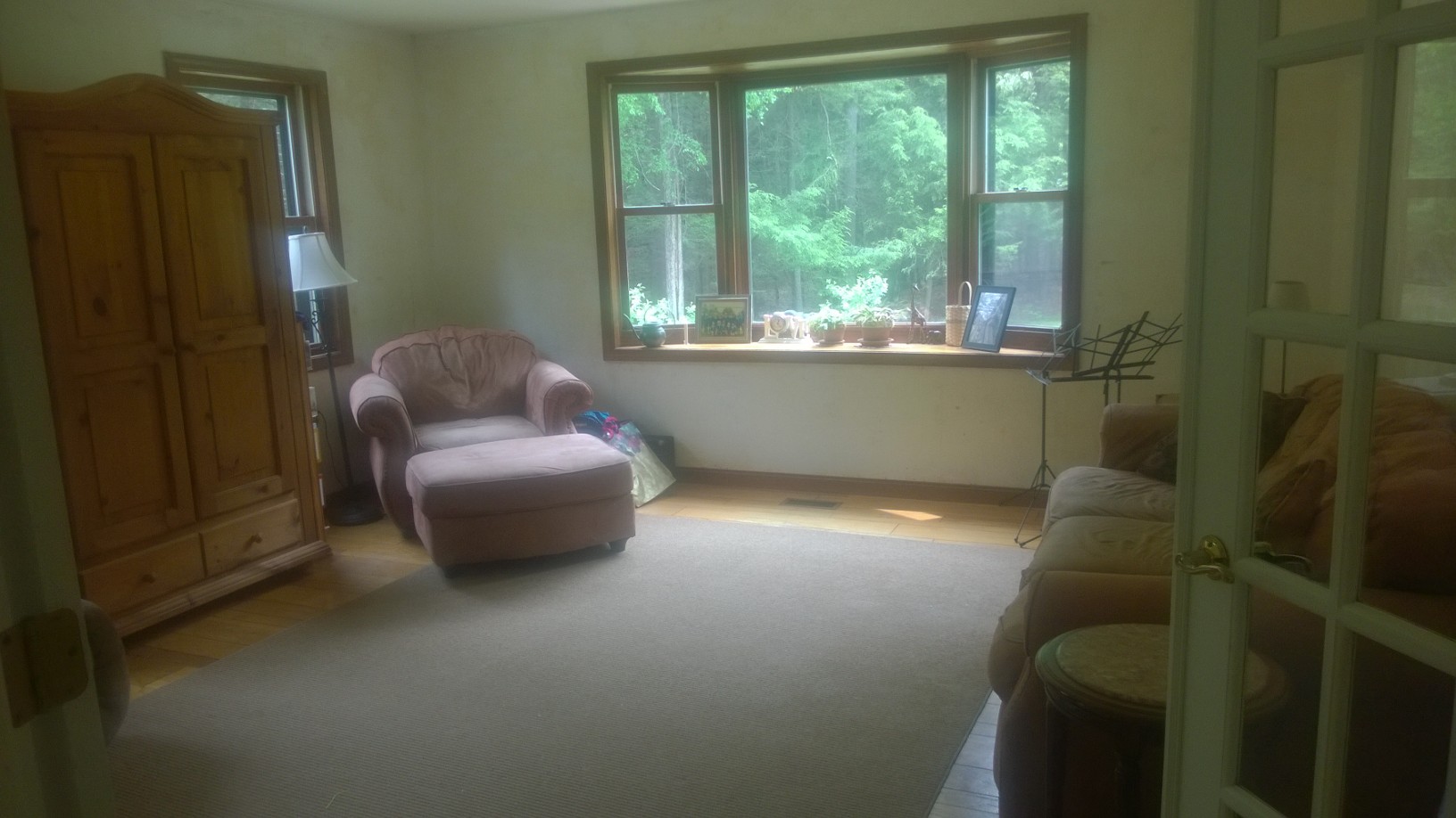
Here is her parlor. She’s in the midst of a big wallpaper removal project, so it doesn’t have any paint yet.
She has done a lot of things right with her space. First her idea to paint all the trim white is perfect. It really does brighten up the space and make it feel fresh and crisp. She also has a nice big rug and not too much clutter.
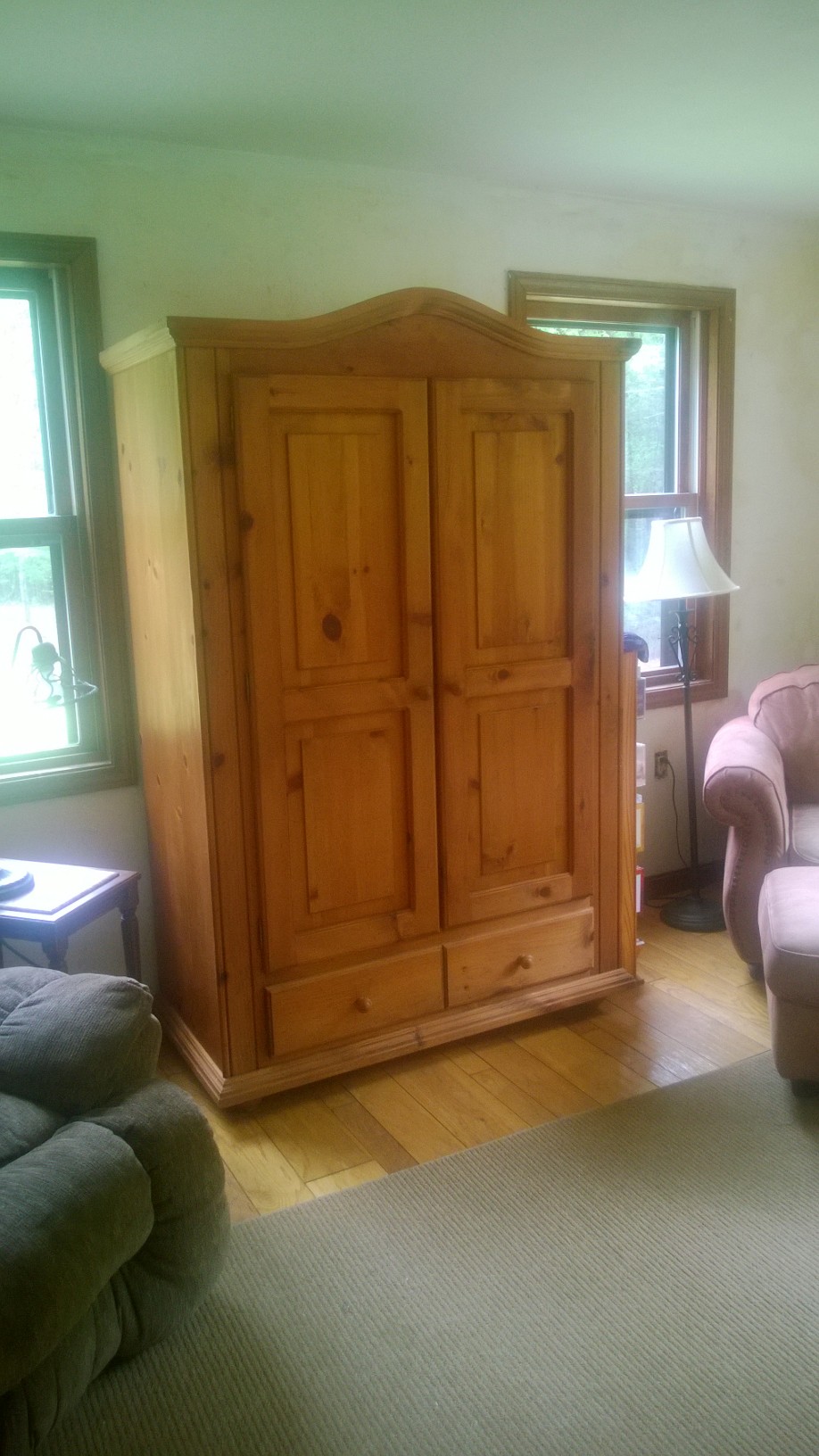
This view shows another window on the other side of the armoire! I love how much natural light is in this room.
When I’m working in a room the first thing I do is empty it completely, then give everything a fresh coat of paint. I know designers think of the ceiling as the 5th wall, but when it comes to a space that I like living in long term, I’ve never found anything better than a bright white ceiling to bounce as much light as possible.
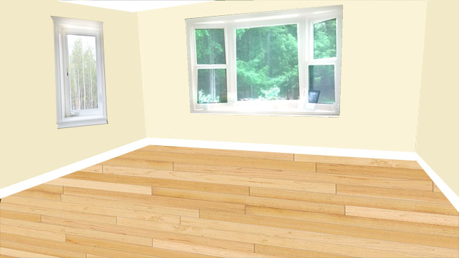
When a room is empty you can see things like: the armoire was blocking the light from the far window from reaching into the room, and it was taking up space that rightfully belongs to curtains.
I decided on a color scheme of butter yellow, pale aqua, and shades of pink. I found a beautiful rug that will bring in the pale aqua without drawing too much attention to itself. Then I tried it on with some fun pink curtains with tassels.
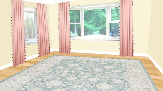
It didn’t have the restful vibe that I thought she would want, so I traded them out for an aqua set with white pinstripes and mini pom pom trim. Texture from pom poms or tassles or a woven in stripe give a design more depth. Also, curtains look best when hung as high and wide as possible. They can be closed when necessary for privacy but when open shouldn’t block any of the glass.
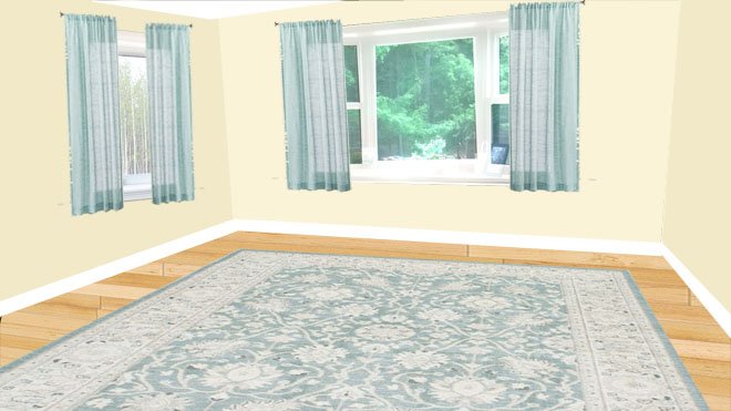
Curtains too low, too short and too narrow.
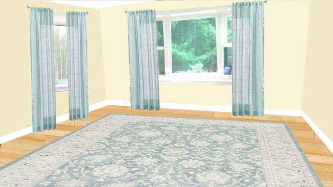
Long curtains hung too low and too narrow.
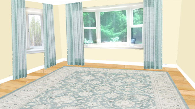
Curtains hung high and wide.
Ahhh, that’s better. Her furniture looks super comfy but a little worn, so I recommend she slip covers it in white or cream. That sounds scary but slip covers wash very well and bleach in the sun. For the best look, sew tailored covers that have separate covers for each cushion.
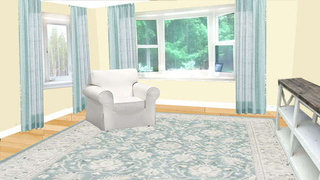
Furniture looks best when it isn’t pushed all the way back against the walls. It also needs to have at least it’s front legs on the rug so everything looks cohesive. To give a place to add lamps on the windowless wall I slid a sofa table behind the sofa. You’ll be able to see the cute X design from the doorway. Free plans here.
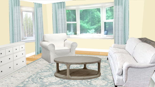
I used a Hemnes dresser for a TV console, but she could use any lowboy style dresser painted white that fit in her space. Unlike the Armoire, it’s low stature will allow light to travel through the space and it can be pulled forward far enough to allow the curtains to hang freely behind it. (It’s on sale for $50 off through the end of May.)
Since everything in this room is square so far, I added a round coffee table (and round stump end table shown later.) They are both easy builds for someone with a little wood experience.
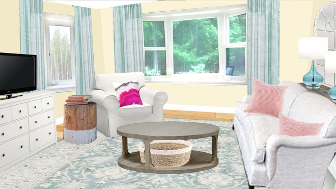
Next up are some cozy throw pillows to bring in our pink accent color, aqua Glass lamps with mirror behind, and a basket under the table for texture (and to hold music stand pieces when they are collapsed.)
The room is still missing something…..do you know what it is? PLANTS! Whether real or faux, plants add greenery and LIFE to a space and no room will feel complete without them.
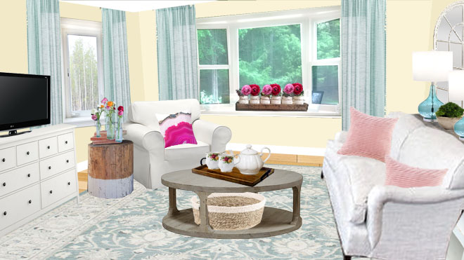
The window box is made from reclaimed wood and filled with chalk painted mason jars with jute trim and stuffed with faux roses and greenery. But Andrea could pot herbs in the jars in stead. A small bowl filled with moss adds greenery where there might not be enough light for a houseplant. And aqua glass vases hold faux flower stems.
If she needs additional storage for sheet music or instruments, she can add a lateral file cabinet or console under the window.

This post contains Amazon affiliate links.
P.S. After I showed her the pictures, she said, “But I’m tired of yellow.” Bwa ha ha! No worries. I showed her what it would look like if the walls were painted Benjamin Moore White Heron. You know what? I like it even better.
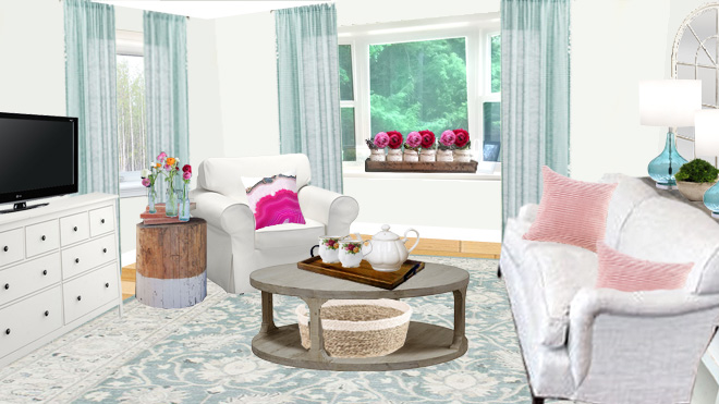
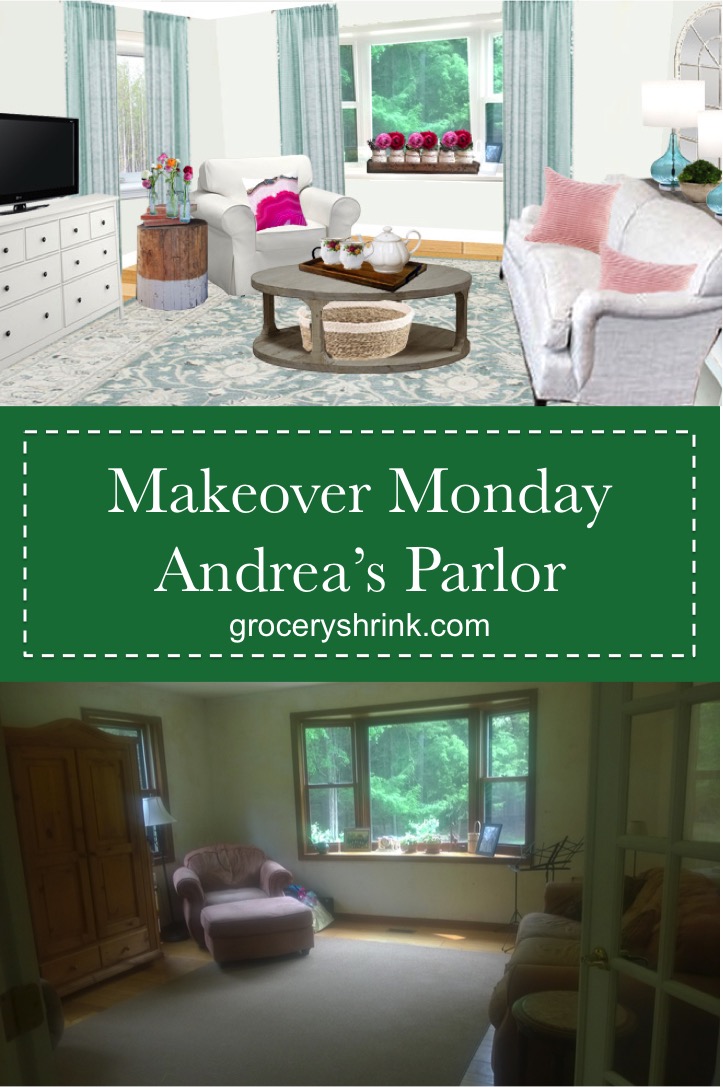
It’s beautiful! We have the Hemnes dresser in the highboy version–great buy.
There is a great Pinterest pic of a table built to fit over a dog crate. She could build one so the table can be used in the foyer. Have a mail basket on it, bowl for keys , vase of flowers etc.