Yesterday, I showed you Kristen’s School Room. Today I want to show you her living room. Just for a reminder, this is her color scheme and we’re trying to fit in a 1927 time period:
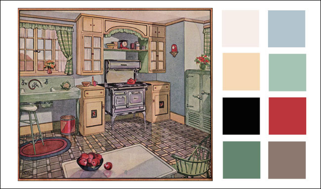
Oh the arches! This house just oozes with charm. You can see how it is adjacent to her sunroom and joined by a nice large cased opening. Can you just imagine seeing that darling school room from here? See the sitting area on the left with the 2 chairs and the side table? That’s where I imagine her piano will go.
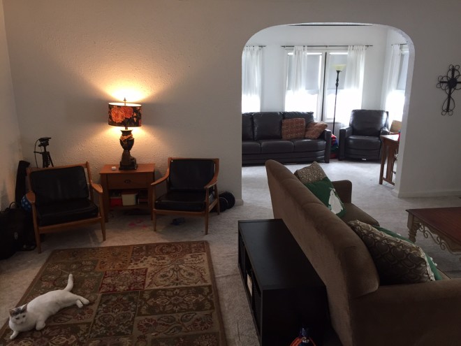
There’s only 1 small window in the living room which makes it a room they don’t choose to use often. They prefer natural light and who can blame them?
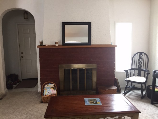
Kristen has a sitting area on this side with a sofa cozy by the fire, and a second sitting area behind with two chairs and a side table. They are a family of 7 and there isn’t a place where they can all sit together at once. I’d like turn the area behind the sofa into her music room and bring in the leather sofa so her whole family can cozy up by the fire. Notice her 2nd bookcase there to the right of the stairs? This would move into the school room to flank the wide opening and make space for an armoire to hold all the violins.
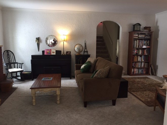
She’s on the right track with the mirrors above the fireplace and the piano to help bounce light, but I think BIGGER would be even better. Big mirrors can be super expensive. My favorite place to buy big mirrors for cheap is Old Time Pottery where I got the 3×4 foot mirror over my son’s bed for $60. Home goods and Hobby Lobby also have decent options, but are priced a little more. Craigslist is another option, but you never know what’s going to be available.
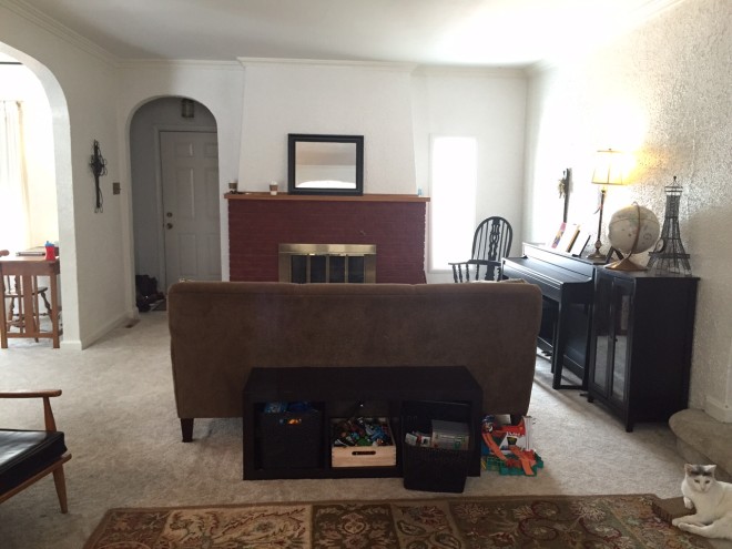
This picture shows their little toy area behind the sofa. If she moves the toys into the school room in the Trofast window seats I showed there, she can put a lateral filing cabinet here for organizing all their music.
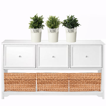
It would act just like a sofa table…only better ;). The little plants and tin Skurar lace pots are from Ikea. The plants are faux but look realistic even up close. They are perfect for this spot in her room that gets little natural light and if they get knocked over in a wild nerf war, there’s nothing to break.
The first thing on my list was finding an area rug. I knew it would either be subdued and take backstage or would be the signature piece in the room. I considered country braided rugs and solid color ones, but when I found this one it felt right for the time period and color scheme:
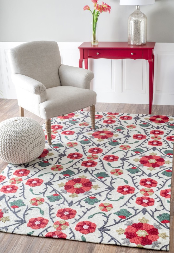
Plus would look darling with creamy checked curtains.
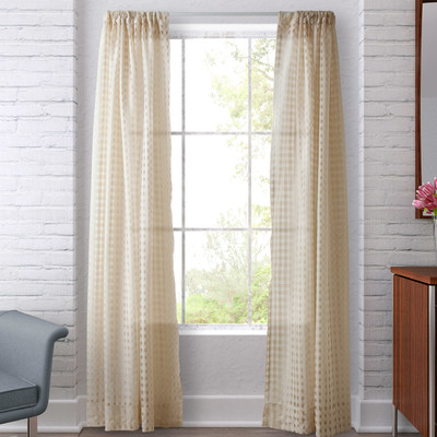
Be careful when buying curtains. Most people never get them long enough. 84 inches is ALWAYS too short. 95″ is the minimum length, even if you only have 8 foot ceilings. Heads up Kristen, these are on clearance so you’ll want to decide about them quickly.
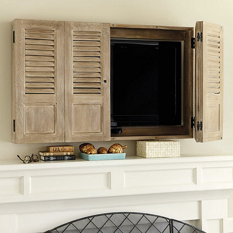
Kristen’s husband prefers to have a TV on this floor. I can hear husbands across the nation humming in agreement. With the walkways and entrances to the room that leaves us with mounting it above the fireplace. That’s not ideal from a decorating standpoint, but with the age and style of her home, a cupboard with vintage shutters to hide the tv when not in use would be darling! Ballard Designs makes one ready to install but she could save money building one with a Kreg Jig.
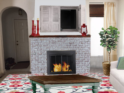
By hanging the curtain all the way to the right without covering the glass of the window at all, it makes the window look like a normal width. I like how bamboo shades add warmth and fill in the space between the top of the window and the top of the curtain. Plants add the final touch of life to a room. Every room needs a plant, real or fake.
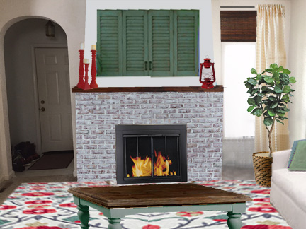
Another option is to paint the shutters green.
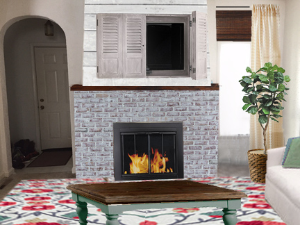
Or plank the wall behind the TV.
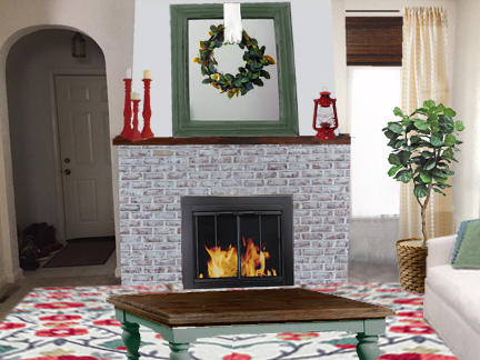
Before we realized the TV was going to have to be here, I suggested a large mirror with a DIY Magnolia wreath on it. The only rule with mirrors is that they need to reflect beauty. Usually the ceiling doesn’t count as beauty (unless it has tin tiles or this.) By propping the mirror from the back to change the angle you can get it to reflect a prettier part of the room.
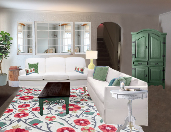
Here’s the view from the other angle. These are her sofa’s just slip covered to lighten the space and tie the two styles together. We used a set of 3 pained mirrors to double the natural light in this room. They are opposite the sunroom windows and will reflect their beauty. The green armoire holds violins and other music bits and side tables in every corner give a spot for a lamp or a cup of tea. In real life, she’ll need to swap the two sofas so the shorter one can go under the windows. Then the one on the right can pull a little closer so it doesn’t cover the walkway even with the filing cabinet behind it.
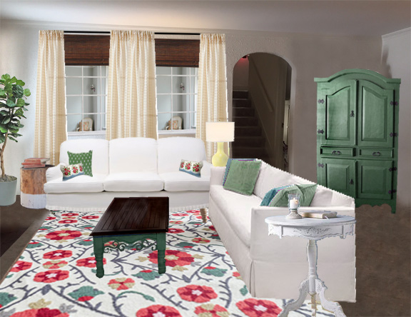
It’s a little more expensive, but you can really trick the eye into believing there are windows here by adding curtains and blinds to the area without covering the window glass at all. I’ve done this in my own home and I have to point out it’s a mirror for people to realize it isn’t real. It’s easy to turn a plain mirror into a paned one by gluing on lattice strips. If you use hot glue you can pop the strips off later if you change your mind about how to use the mirror.
The one additional thing that would make a huge difference is ceiling lights. The least cluttered way to add light is with recessed lighting in the ceiling.
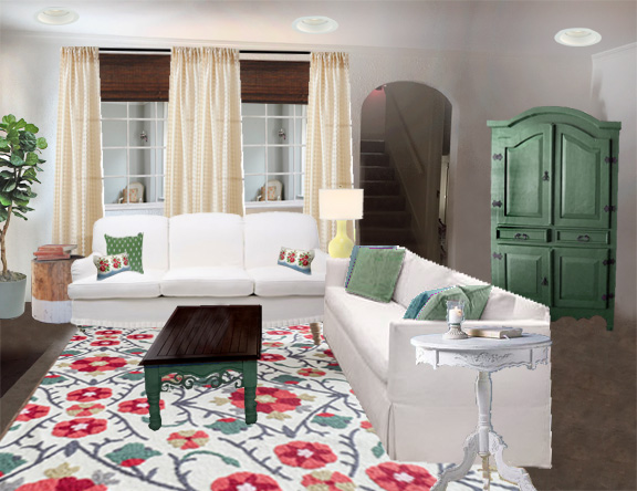
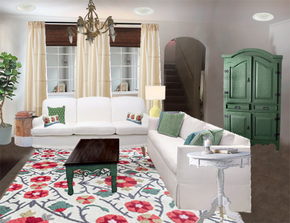
And add coziness with a central dramatic light fixture. This first one is an authentic circa 1927 chandelier that might be hard to find in real life, but is true to what would have been put in when the house was built.
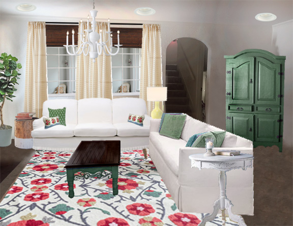
Or she could go with a modern fixture that has farmhouse flair.
Depending on who owes you a favor adding wiring for lights to finished space can get expensive. Less expensive options are adding lamps to each side table and to the top of the filing cabinet, or suspending corded pendant lights from ceiling hooks. It always amazes me how lighting changes the whole feel of the room.
Before I go, here’s a final before and after shot:
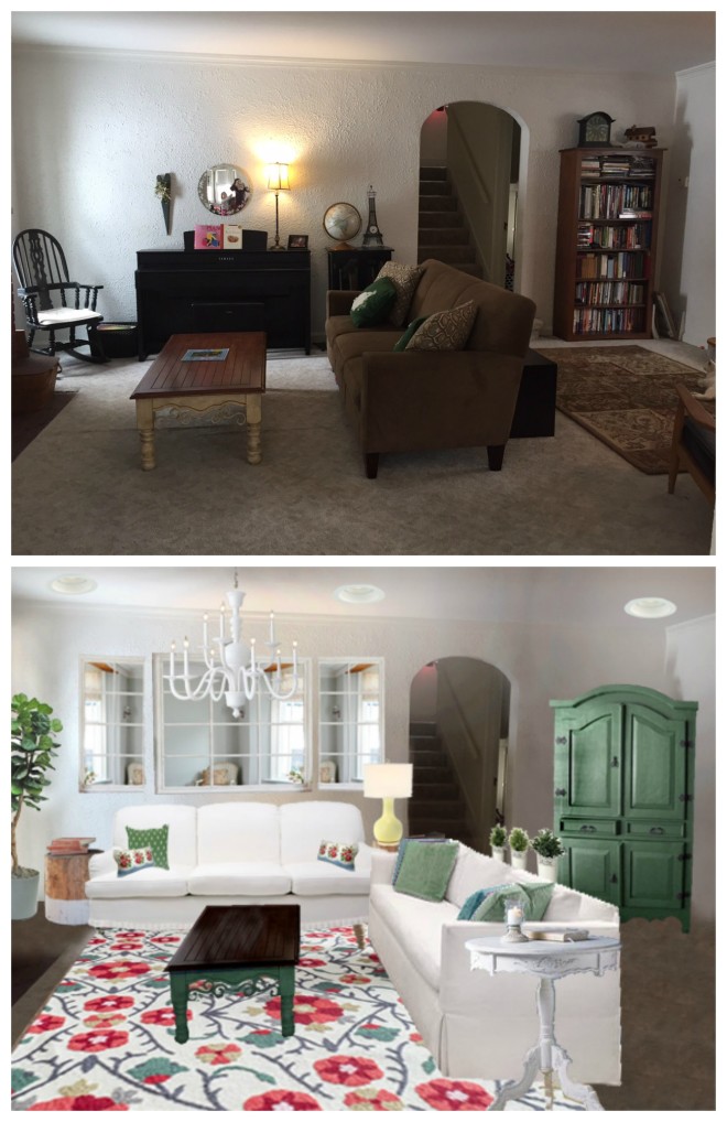
What do you think?
P.S. I just have a few room design spots left in my etsy shop.
Kristen Myers
Beautiful!!
How did I miss this earlier?! I didn’t quite realize it until starting this process that over the years from hand-me-down furniture and thrift stores that we had collected such dark pieces! Add to that the fact that we have lived here over 3 years and haven’t really decorated…I’m so glad the rooms will soon come to life 🙂
Beautiful job! I especially love the mirrored window wall. So clever! I’d like to mention something that we did in our home with all our violins. You can buy wall hangers & turn instruments into art, which makes them easier for kids to grab (getting instruments out and ready to go is half the battle sometimes), and it doesn’t take up all that storage space…like in an armoire, it encourages them to practice more, and hangers are pretty cheap compared to wall art. It’s worked great for our large family of musicians in a tiny space. Just thought I’d throw that option out there b/c I love it so much. 🙂
Lindsay, I love the idea of violins for art! I’ve had my clarinet out for 2 days and I pick it up every few hours and play until my lips are too tired. When it was in the case I didn’t touch it for….ahem…..years.
My only concern would be white furniture if she has small children or muddy paws from animals. I do love the use of the mirrors to create another window–great idea!
Carrie, That’s definitely something to consider. Hers are white only by slip covers, so they whip off and wash in a flash. We’ve had our white slip-covered sofa a year and haven’t washed it yet, but we only pet sit and don’t have pets full time. I do use a lint roller on it occasionally to keep it fresh looking.
Love the makeover! So glad to hear we’re your mirror destination!
Michael, thanks for taking the time to comment. It’s an honor to have you stop by. I have quite a few Old Time Pottery mirrors in my home 🙂