It feels a little silly writing a kitchen makeover post for myself, when we just gutted and redid our home about 4 years ago. My mom is having a hard time imagining that I would consider painting 4 year old cabinets, when she wouldn’t dream of painting her 40 year old cabinets. I can see her point, though I don’t share the guilt over painting good wood that she feels.
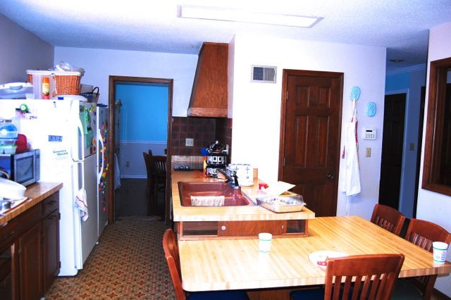
The kitchen in 2012 when we bought our house. The door you see straight ahead is the old pantry, which I loved but removed anyway. The blue top and gray bottom is the old dining room, which became the new kitchen. Right through the doorway on the left, we cut an arched doorway in the dining room wall to create the entrance to the new laundry room and pantry.
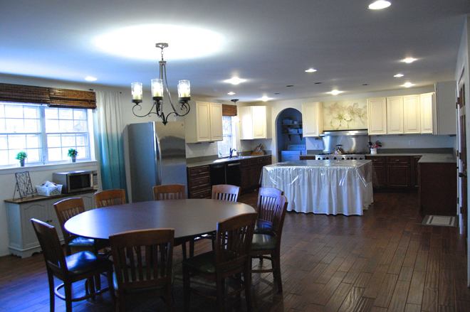
The kitchen in 2014 with the camera standing about 10 feet to the right, but pointing the same direction. We removed several walls, and pushed the kitchen to the old dining room area making a large open space. Since this photo was taken, we’ve added the fridge cabinets, and crown molding. Both tables are folding tables being useful while we save up for real furniture.
A good friend told me, “Don’t ever feel guilty about painting something you hate.” And while I definitely don’t hate my cabinets, I don’t love them either. We ordered from CabinetGiant.com, because of their amazing prices and great quality and because we didn’t have an IKEA at the time or any hope of one coming soon. (So glad to be wrong about that one.) The doors, when they arrived, didn’t match the sample. They were much more yellow based in tone when we were expecting a brighter white with some glazing depth. At the time, I had been without a kitchen for a solid year, cooking on an electric skillet and in a crock pot for a family of 8, and never eating out. I also had a couple of toddlers, while trying to homeschool a struggling fourth grader, and teaching part time at a private school. I was undone. Yellow cabinets were the least of my worries, so we put them in.
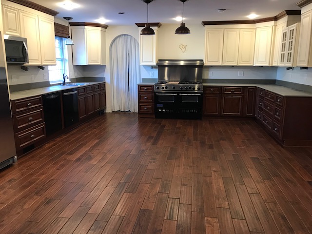
The kitchen today, quieted and the folding table island removed. The thing that glares at me most about it, is the overwhelming amount of brown wood. When we designed this kitchen, I thought the floors would be enough lighter than the cabinet lowers that it would be ok, but it’s not my favorite.
It took me 2 years to even notice the cabinets clashed with my wall color. At first glance it would be easier to repaint the walls than the cabinets. The challenge is, the entire 5,000 square foot house is painted Behr Silver Drop and it’s all open concept, which means I’d have to paint the whole house to change the kitchen color. Painting cabinets started to sound easier. Add the fact that I’ve never liked the cabinet color, and it’s a no brainer.
The whole kitchen was a compromise. We live in the midwest, where decorating trends are a good 5-10 years behind the coastal states. So we were still enjoying the end of the Tuscan Beige era. I craved a bright white kitchen, but my husband had been dreaming of finally being able to afford a rich Tuscan Beige kitchen like we had seen in the nicer parts of town. I didn’t hate that look, while he definitely seemed to dislike the white shaker style I preferred, so I compromised.
Then a blessing hit us, that I couldn’t see at the time. We lost our life savings to a foundation repair which meant we couldn’t finish the kitchen. If that hadn’t happened, I definitely would have selected granite countertops that I would have hated in just a couple of years, and been stuck for decades because of the huge investment. Instead we spent about $200 on hardwood plywood that we painted and sealed with marine poly. They have served us for 4 years, though the seams split early on and the marine finish wore off after a few months of daily washing and they are now stained and showing signs of water damage.
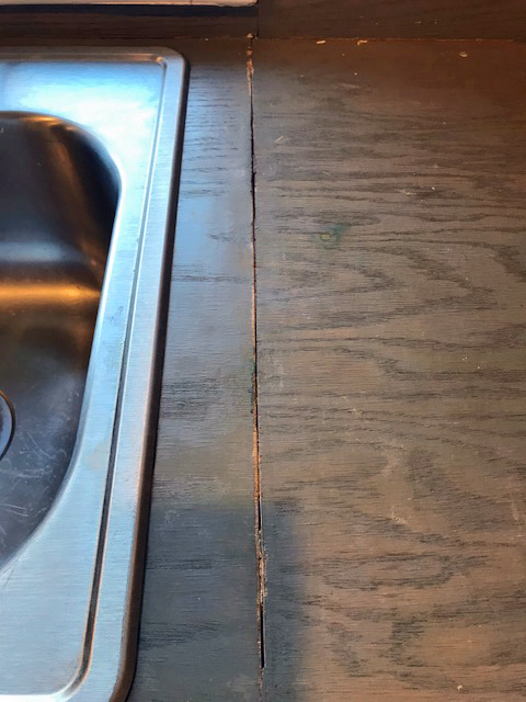
I painted the plywood countertops a medium gray, hoping to bring the kitchen into the current decade, but instead it just drew attention to the fact that it didn’t harmonize. It was a good lesson to me that if I can’t afford to fix the glaring problem, it’s better to work WITH it, then to ignore it or fight against it.
It’s finally time for us to finish the kitchen! (Our bedroom comes first on the project list, but I like to decide on finishes far in advance so I have time to research prices and wait for sales.) Here’s our to do list:
- Break up all the dark wood
- Replace my double sink, with a huge single apron front sink.
- Install Countertops
- Install a backsplash
- Install a range hood
- Build an island with a sink.
- Choose counter-stools for the island
- To paint or not paint the contrasting crown molding.
I also may need to change the island pendant lights, but didn’t focus on that with this photoshop plan.
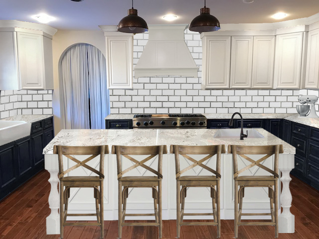
First, I tried navy paint on the lower cabinets and white crown, which I LOVE. It broke up all the wood, but when I installed a white island, it gave the same affect without the need to paint all the lowers. I’m all for less work, lol.
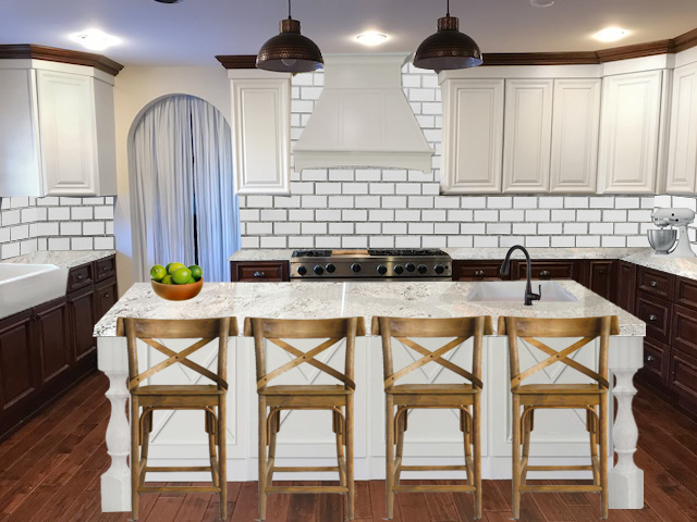
Here’s the same look with brown cabinets and brown crown. I like this ok, but the stools (which I love the shape of) fight against the other wood tones and don’t relate to anything in the room. As much as I like the wood lowers better with the new whiter uppers, I still loved the navy more. The original navy view felt a little too white, too sterile. So I tried switching out the range hood for reclaimed wood.
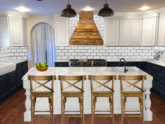
I like how the reclaimed wood had parts of the dark wood color from the floors, but brought in lighter wood tones too. Then I thought I’d switch out these expensive stools that didn’t quite blend with the floors, with some low profile stools for 1/3 of the cost.
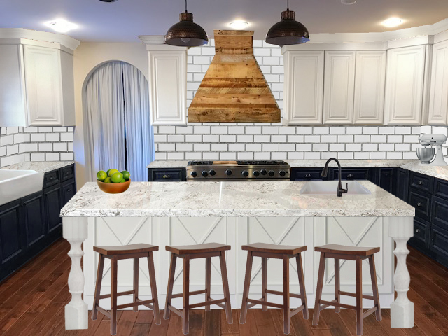
They are ok, but I’m going to look for a third option in a color that’s a perfect blend of the two, a lighter wood like the hood, that plays nicely with the redder floor tones.
The last thing I wanted to try was painting the crown navy to match the lowers instead of white to match the uppers. The risk is making the room feel short again. It’s 18 feet wide, so short ceilings are a minor issue.
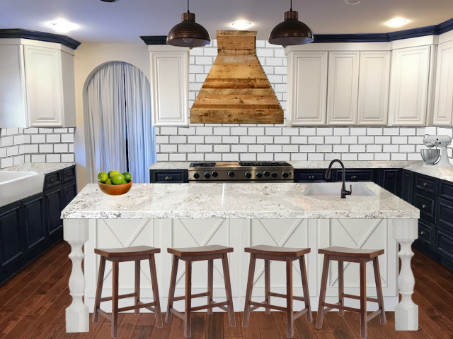
While I like this, I think I like the open airy feeling of crown that matches the upper cabinets better.
This exercise has me itching to paint right now. I’ve had the upper cabinet paint on hand for over a year already. But I promised myself I’d finish some of the other projects I started and didn’t finish, like painting the foyer, first.
If this were your kitchen, what finishes would you pick?
Sources:
Navy Paint Color: Behr Starless Night
White Cabinet Color: Behr White Pepper
Island turned legs: Etsy Design59Furniture
Backsplash: 3×6 Mohawk gloss white subway tile
Countertop: Not sure on our final choice, but we are looking at Marble look quartz options. I’m afraid the cost will be impossible. I haven’t eliminated the possibility of a good laminate.
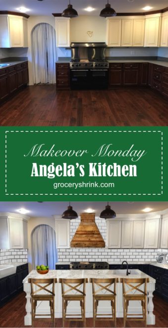
I would paint the upper crown the same color as the upper cabinets. It draws your eye upwards. The dark crown is jarring.
Just an FYI those counters look like marble…marble does not wear well, it shows stains very easily.
I’m getting ready to gut my 1955 kitchen. We’re going with Shaker cabinets in Linen from http://Www.cliqstudios.com The price was fantastic…and great quality.
Renee, thanks for the tips. The counters are marble look quarts, but still might be too pricey for us.
I would match the crown with the upper cabinets as Renee suggested. I think you could stick with the wood cabinets on bottom with the island. You could always go navy later.
I like the first picture best. Have you considered a stainless steel hood? If you went with the white hood and light fixtures that came down a little farther and echoed some of the criss-cross and tones from the stools that could help. I would definitely look at hood options and light fixture options together since they will overlap in your line of sight.
Definitely paint what you hate! I love hearing how you fix and live with something while figuring out what you really want.
I like your light ideas! Darren’s going to be unhappy because he installed these (which I loved when I bought them) but since then, I’ve decided I’d like some lights a little bigger and lower, with more dramatic styling. The hood insert is stainless steel, but we were hoping to cover it with something less industrial looking, and probably will need to build it ourselves because of budget issues.
If you love the navy on the bottom, do it! 🙂 Life’s too short to have a kitchen you only kind of like. I agree with the white crown molding. The last stools you chose are a good pick. I personally hate stools with backs, they are limiting to my boys. 😉 Haha!
Good luck, and best wishes for a speedy bedroom re-do so you can get going on the kitchen!
Lol on the stools! I do like shorter profile things. They make the space feel cleaner.