Bethany is a homeschool mom to 8! Her dining room doubles as their homeschool room so needs amble storage. They also hosting family dinners for 20-30 people. It’s great that they have an open floor plan so the crowds can spread into the kitchen and the living room and still feel connected.
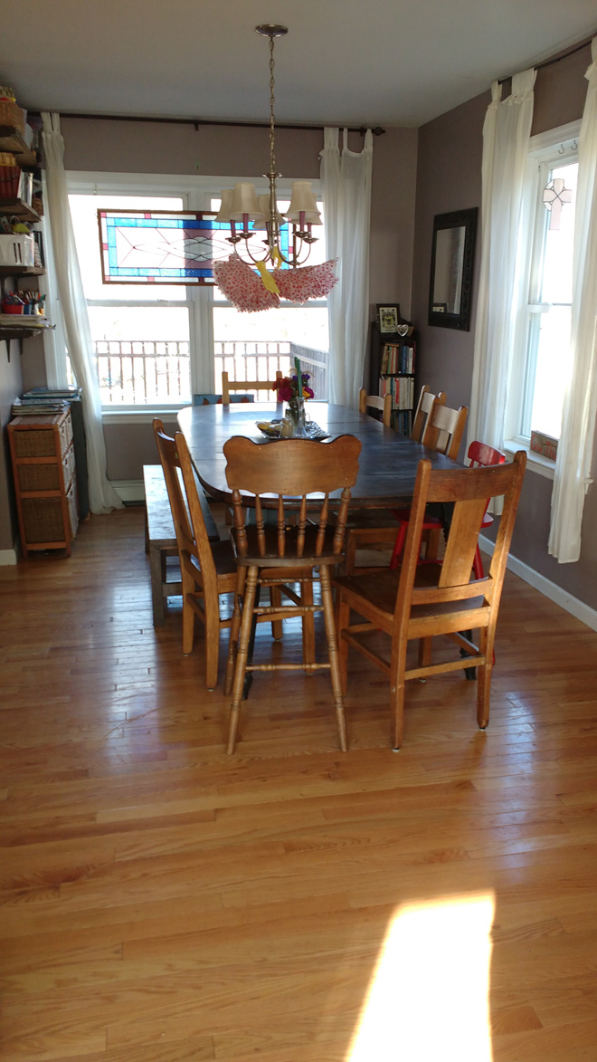
She writes: ” The stained glass in the window was made by my uncle, and I really love the plum color in it. I also have a stained glass with aqua in it. And I have a China cabinet that I want to repaint on the opposite wall (maybe white? Or a fun, bright color?)
Right now, I think the wall color is bringing me down. It’s just too blah. This room is in the north side of the house, so the light isn’t as bright. I don’t like white walls, but I need something light. I have thought about painting the chairs white, or all different colors of purple.”
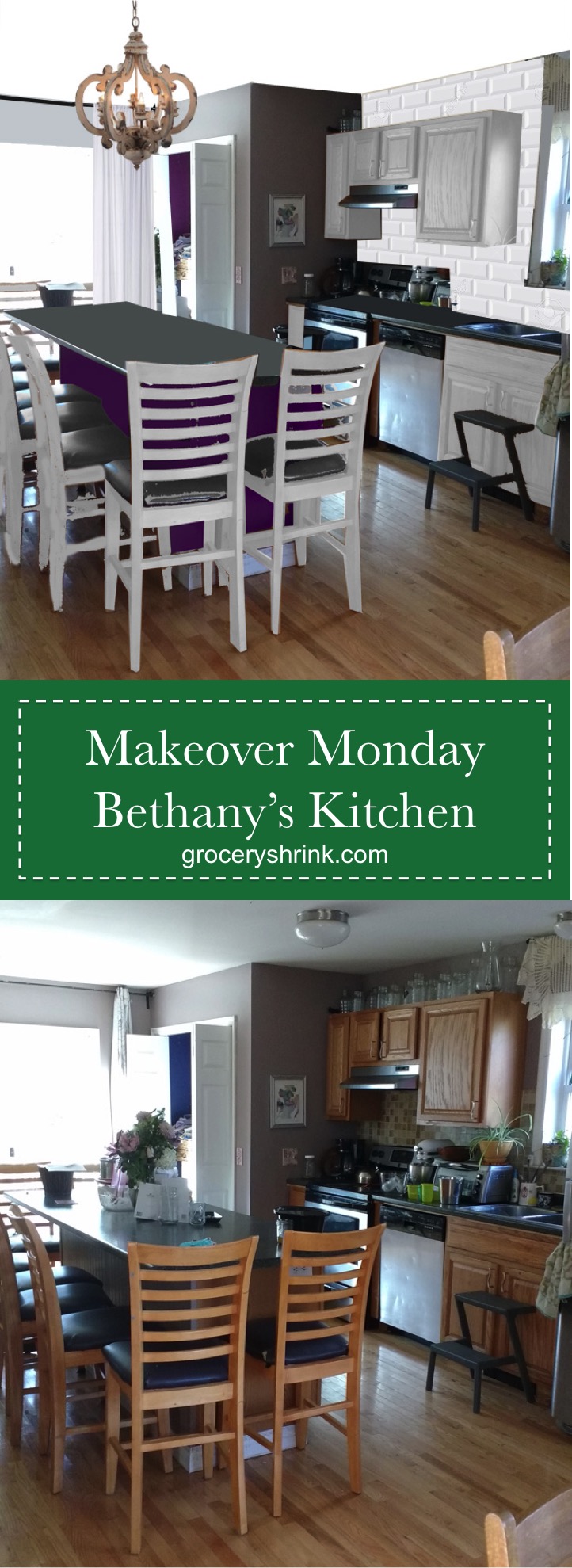
Bethany! Thanks for being a long time fan and for reaching out. I think your wall color is charming and a good accent for your special window, but it’s pink undertone is fighting with the yellow undertones of the backsplash. My first choice would be to replace the backsplash with a classic white subway tile. This tile was first used in 1904 and it’s vintage charm insures it will never be “out.”
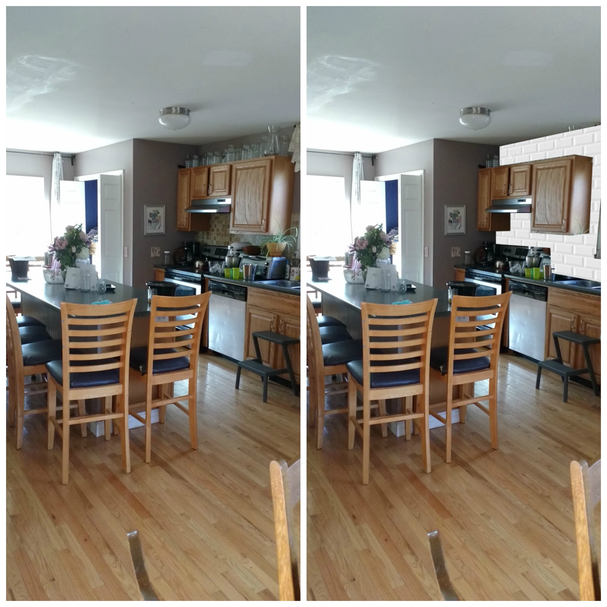
I love your light colored hardwood floors. Lighter, more natural wood tones are at the front of the trend right now and your floors are perfect. The cabinets and most of your furniture match them perfectly, which sounds like a great idea, but can make the room feel “flat.”
To break it up a little, I recommend painting your cabinets and island chairs white with gray seat cushions. I also gave your island a little pop of plum color to say “Hiya” to your stained glass window. Inspiration here. I had trouble getting the color right, it’s too bright, but you get the idea. (If you don’t tile across the top of the window, add a bamboo blind.) With the updates, I think your paint color works.
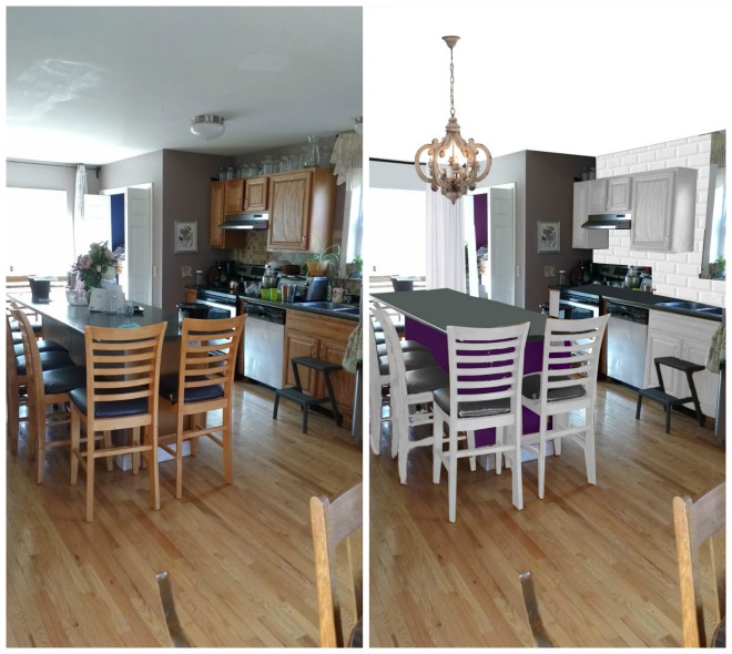
(The bright purple was bothering me, so here it is a little darker. You can choose whatever shade coordinates with your stained glass the best.)
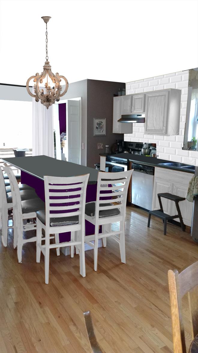
With the cabinets painted, the chairs could be left wood toned for more warmth if you prefer.
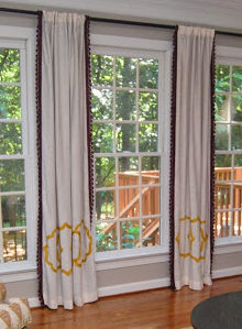
You already had the perfect curtain rod on the kitchen side and your curtains hung high and wide. I just gave you some beefier white curtains to fill up the wall space a little better. I think they would be amazing with plum colored pompom trim on the edges. Like these without the yellow embroidery:
Here it is with Revere Pewter paint. This paint is a little more friendly with your backsplash–a warm yellow toned gray.
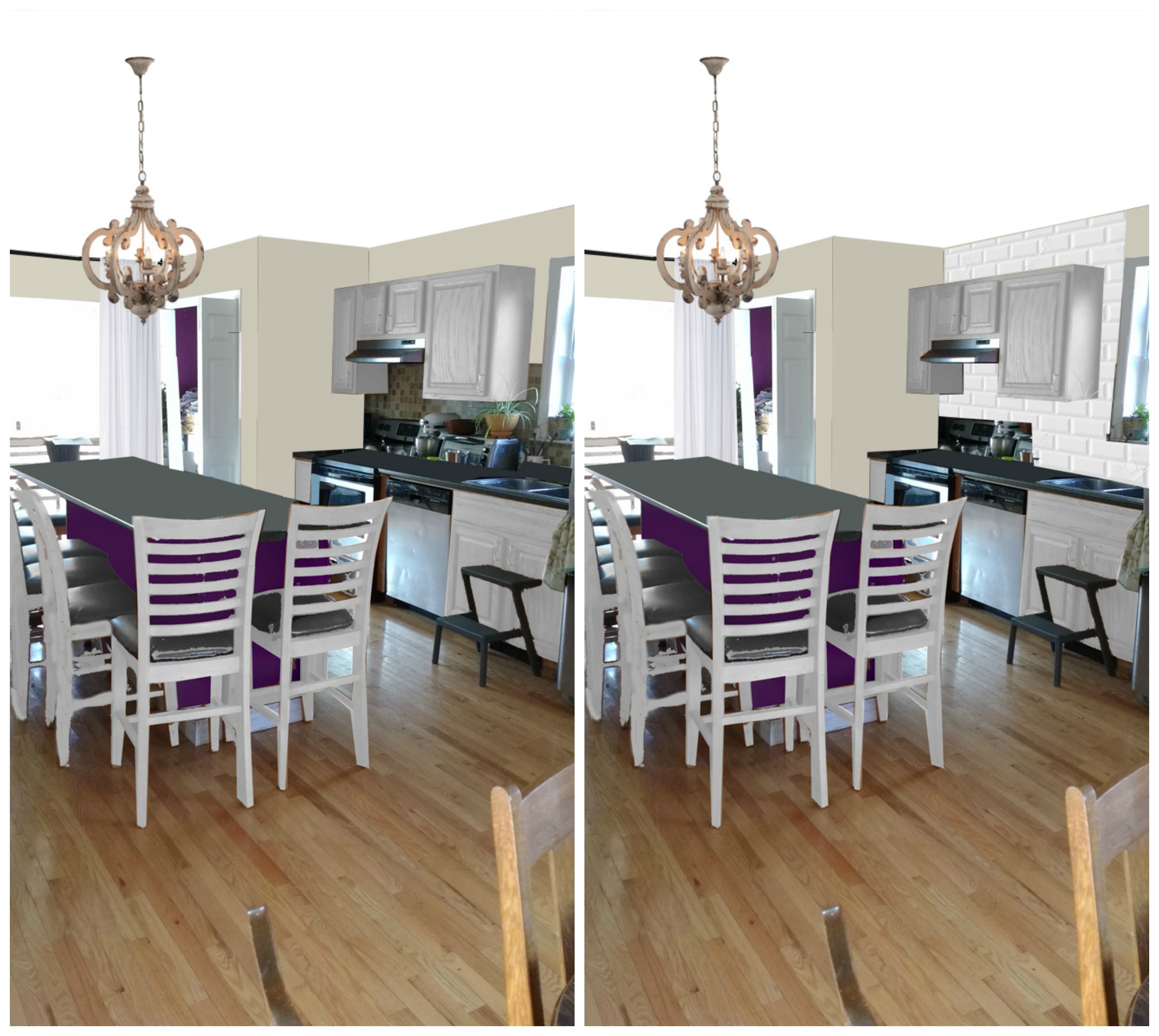
I gave you a statement lighting piece in aged wood to add character and warmth to the space.
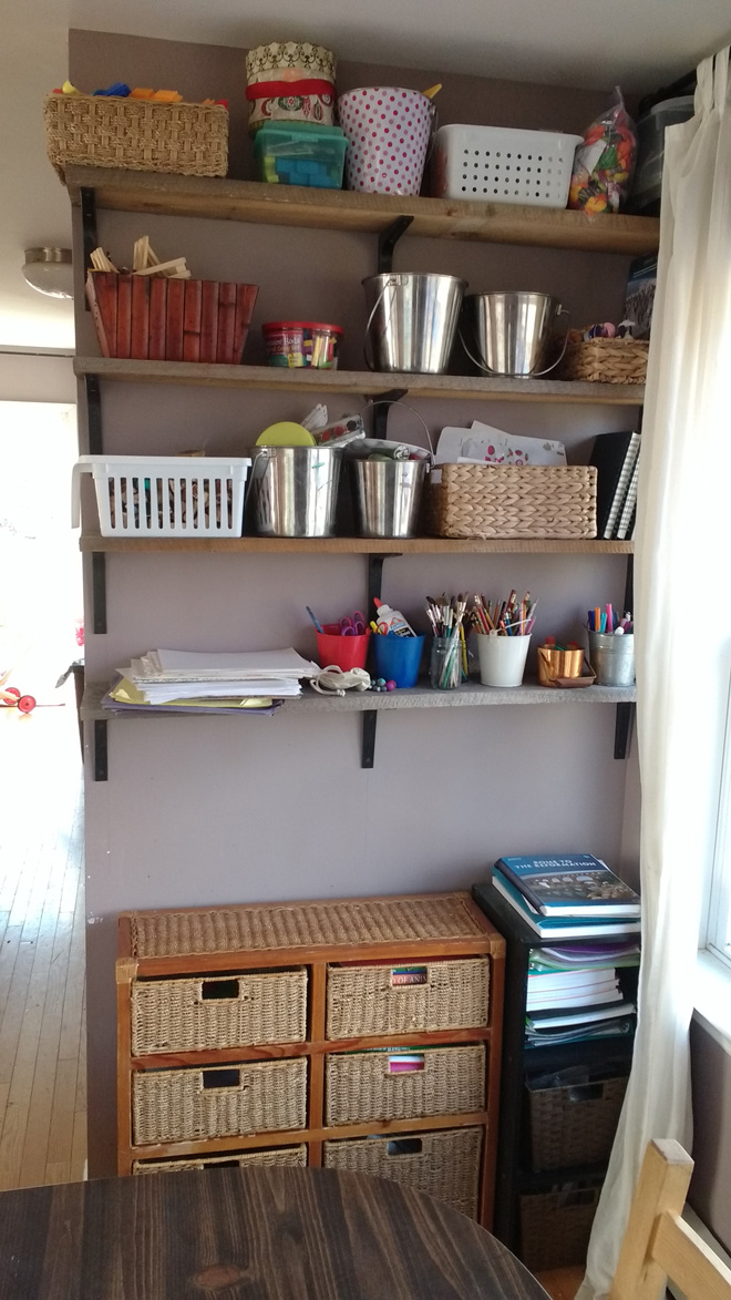
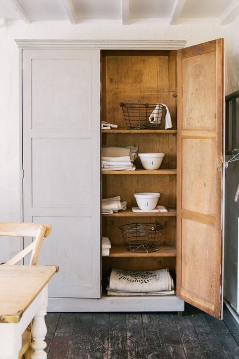
The depth of the wall on this side of the window looks narrower than the other side. I would swap your homeschool storage with the mirror, so your curtain can hang freely on this side. And I would swap your open storage with a vintage look armoire, so you can close the doors and quiet the space. (Make sure it’s narrow enough to not block the window on either side. If you can’t fine one on craigslist, you could consider building one out of Billy bookcases, covering the upper glass with gathered white cloth and leaving the very top clear glass.)
Like this one:
Or this one:
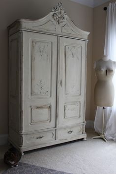
I love the dark color of your table and would keep it as is, but paint the dining chairs to match what you do with the Island seating.
Beef up the curtains to match what’s in the kitchen, and make sure they are all floor to ceiling. I’d be tempted to buy the thickest white Ikea curtains and crochet pompom trim edging to save money.
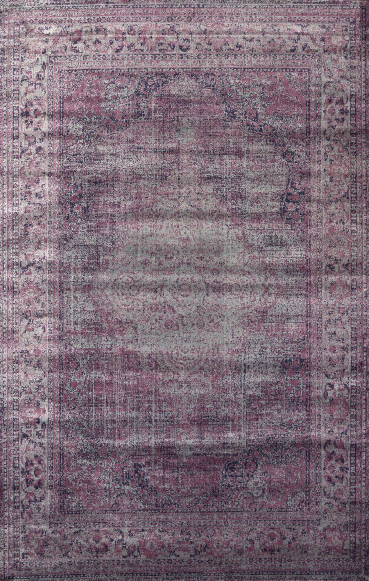
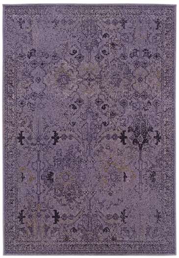
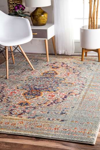
The last thing to cozy up the space is probably not practical at all for a family of 10, but a rug on hardwood grounds the space and brings in a cozy warmth. If you go for it, get it big enough that all the chair legs will stay on it when people are sitting. And choose one with plenty of pattern to hide stains. Here are some ideas:
If you’d like to add some finishing touches, I’d do crown molding all around the room and swap out the dining room Chandelier with one that coordinates with the one over the island.
Would you like your room photoshopped and featured on Makeover Monday? Send a few photos from your space to angela@groceryshrink.com and tell me your hopes and dreams for the room.
Get a full service virtual makeover complete with 3D room layout plan, 2 photoshop views, step by step work list, and within your budget source list. Find out more.
Learn how to use Photoshop for your own designs with the Room Makeover class.

Nice rooms to begin with but all the changes really make them shine. I especially like how the pops of white make everything feel more put together and fun. The white curtains with purple trim would really make the colors in the stained glass piece stand out too.
Very nice!