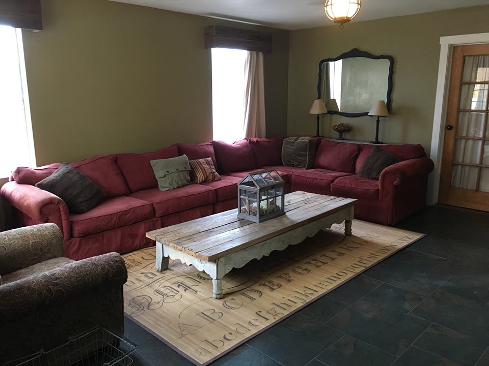
Priscilla is drawn to the light and bright Modern Farmhouse rooms from Fixer Upper, but her furniture is full of color. Without a budget to buy new, she wasn’t sure what to do. She wrote: Need help with giant sectional. I’d like to lighten it up a bit, but so far I don’t like the contrast of light pillows. And how do you know how many pillows?
Anyone else notice her beautiful wood and glass door? I LOVE that color of wood. And that mirror! It’s huge and such a great shape. Her coffee table is the perfect size and shape for her sectional. Even her light fixture has great character.

Here’s what she says about her sectional: It’s super comfy, almost all of us fit on it, but it definitely makes a statement. My head is turned by all the lovely, neutral, pale farmhouse/cottages. But, alas, my true love is color. Trying to dip a toe in the shallow end with some cream pillows. They didn’t play nicely with the red beast. Maybe more of a burlap color?
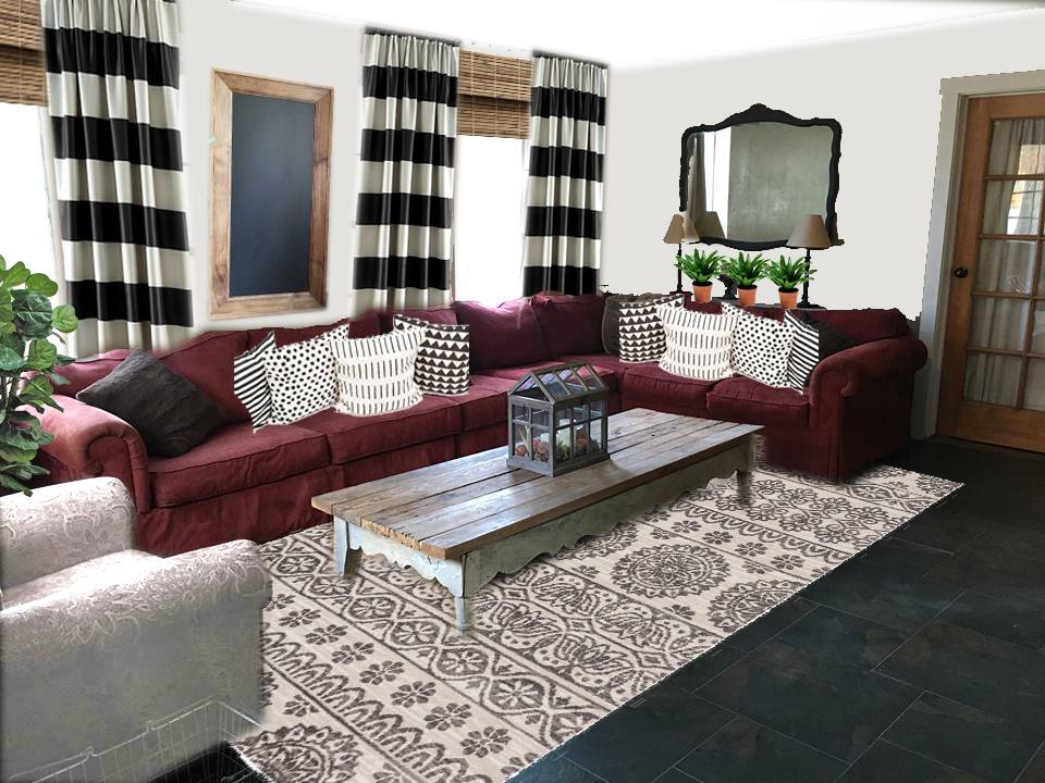
The angle of this photo and the full view of the space was so perfect for photoshop that I couldn’t help playing a little. She’s right that pillows can really help to lighten a dark sofa, but in this room she’d get an even bigger impact from changing the wall color. Painting can sound like a daunting task, but all you need is a gallon or two of paint and two 2 hour sessions to do it.

Notice the impact big TALL drapes make? These are from Kohls, but if budget is tight you can grab $4.88 twin flat sheets from Wal-mart, and fusing on the stripes. Hang your drapes to the floor even if your furniture is in front of them. Just pull the sofa far enough forward that the drapes can hang freely. P.S. The Kohls drapes are only 84 inches and that won’t look good in ANYBODY’s house. We need 95 inches or longer, even with 8 foot ceilings. The sheet option is looking better and better.
I created friends to the wood in her door by adding wood shades and frame around the chalkboard. She can write whatever she wants on the board, such as laurels, or she could use washi tape to adhere feathers.
That’s still her same chair in the front left corner. I just added a slipcover so she could enjoy different prints and patterns in the room. Don’t be afraid of light colored slip covers. Baby wipes and a lint roller keep them looking nice in between washings. And guys, I only wash mine once a year or when we’ve had a big enough oopsie that a baby wipe won’t work. I have 6 kids and 5 kittens. We know how to get stuff dirty.
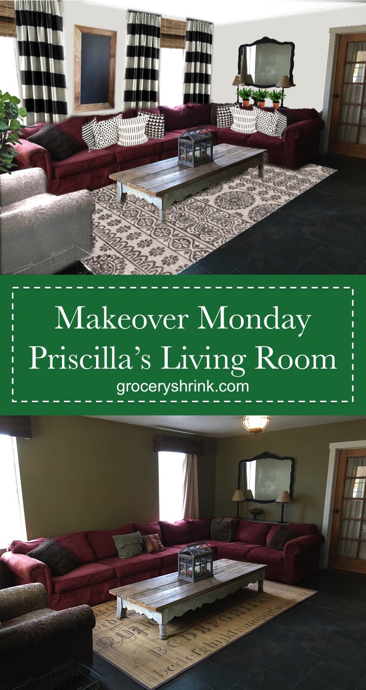
I used all her same furniture, lamps, wall art, but with lighter wall paint it looks like a completely different room. The rug is a splurge from Joanna Gaine’s new line. It also comes in dark black, but I thought it would be too bold against the already bold curtains. That’s the secret to matching patterns: Let ONE be the big bold leader of the pack, large and in charge. Then layer in your different scales of pattern in similar color tones. With the different scales of graphic prints in the space your eye goes to the curtains first, but has resting places on the pillows and rug too. Also the rug is a size bigger than her old one. Having a big enough rug really helps. Save up until you can get one where all the furniture can at least have their front legs on the rug.
Her reaction: That is great. I would have to redo the whole house, and that lovely cream chair would last about five minutes. I’m just gonna enjoy the fantasy for a moment. I do think I will add those three ferns to the sofa table.
Would you like your room photoshopped and featured on Makeover Monday? Send a few photos from your space to angela@groceryshrink.com and tell me your hopes and dreams for the room.
Get a full service virtual makeover complete with 3D room layout plan, 2 photoshop views, step by step work list, and within your budget source list. Find out more.
Learn how to use Photoshop for your own designs with the Room Makeover class.


amazing! love the black and white accents and the new rug and the wall color change. much better.
I think you did an amazing job at using what she already had and making it all tie together and have that “fixer upper” feel. You gave very practical and doable things for her to do. Great job!
Wow! You have a great eye and talent for decorating. I was curious as to what you would do and super impressed with the result.
WOW I love this!!!! I have a chocolate brown sectional and I think I could do something like this too it!!!
Wow! You did a wonderful job Angela! You do have an eye for transforming a space on a budget, with reasonable, doable changes. I love the impact the curtains have and the larger rug! You definitely helped “neutralize” the sofa.