Lindsey recently moved into this home with gorgeous thick wood molding. The living room is open to the
dining room and kitchen with a wide cased opening.
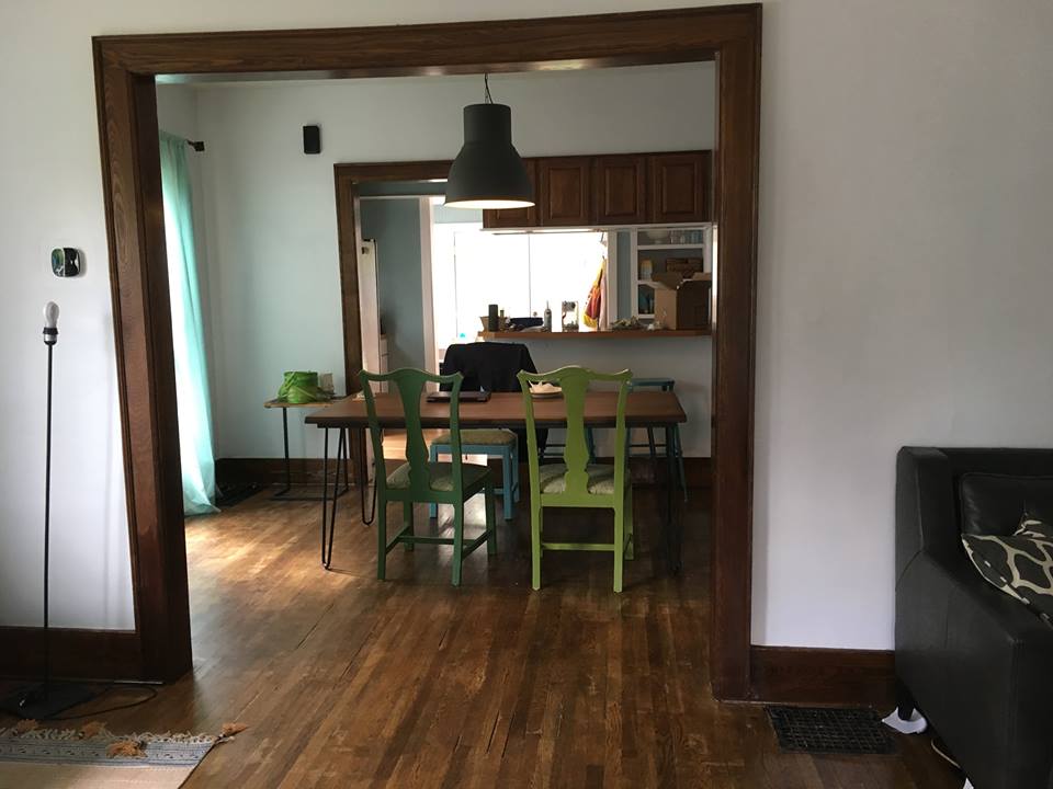
She writes: “The only things that NEED to stay in the room are the couch, the curtains, and the white paint. Everything else is leftover from our old house and can be eventually replaced or moved elsewhere. (The rug is new but doesn’t have to stay in this room.)”
In addition to help with the awkward layout, she asked for assistance with lighting and how to cover so much blank wall space. She had a really great floor lamp, but it wasn’t enough to light the 20′ long space without central light fixtures. She requested more help with lamp placement since ceiling fixtures seemed way too expensive.
The challenge is the living room’s 11×20 floorprint, making furniture arrangement difficult. It’s so tricky, I had to mull over it for several weeks before I came up with some options.
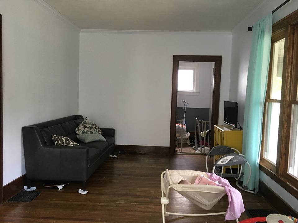
The door you see here, leads to the entry, and the previous owner had the cable hook up installed right by the door. That makes it feel like you have to have your TV right there, covering up part of the doorway trim, and leaves the larger half of the room awkwardly wondering what it’s function should be. 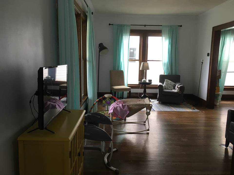
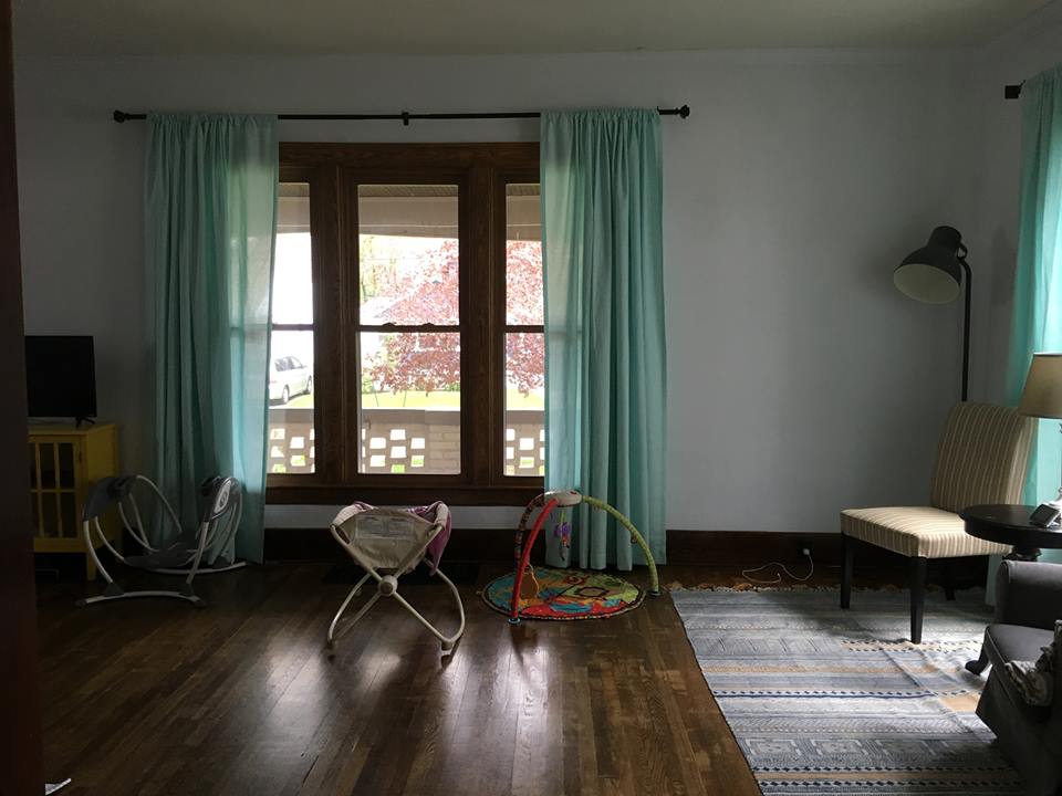
Moving Cable hookups is a fairly simple project (according to Pretty Handy Girl.) So I slid her console further down the wall so she could center her seating area on the window. Normally I wouldn’t put furniture blocking a window, but since these windows go all the way to the floor it’s the best option. The trick is to make sure the cords are hidden as much as possible to look ok from the outside. I would attach them to the back of the console with matching yellow tape.
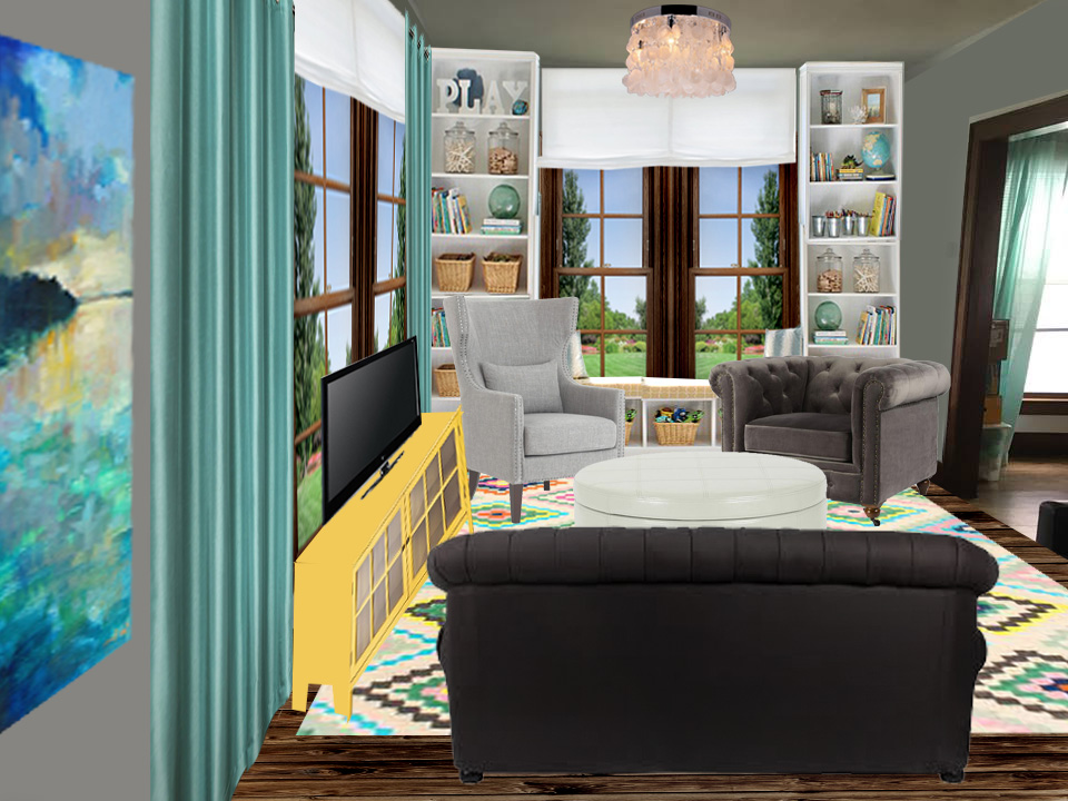
In our personal house projects, we have found that electricians will often work evenings on side jobs for extra money and charge around $30 an hour. They can create hookups and install light fixtures in 2-3 hours, making them cost the same as buying a handful of table lamps. So just in case I could persuaded her, I put a pair of matching flush shell chandeliers in the space. Just because the ceilings are 8′ doesn’t mean you can’t have statement lighting. These only have a 12 inch drop and each hold 4-60 watt bulbs, but she can go even brighter with LEDs if she needs it.
If she prefers, she can add accent tables (stump tables are my favorite when the budget it tight) and add lamps to them.
I added some built in shelving to surround the window. This pulls the wall closer while giving her extra storage and a little bench under the window. The wood frame of the bench, ends under the glass of the window, but the cushion is above. A Roman shade hung from the ceiling adds softness to this end of the room and visible height. It can be pulled down for privacy, but when raised up, doesn’t block any natural light.
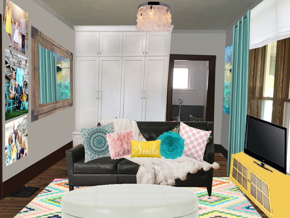
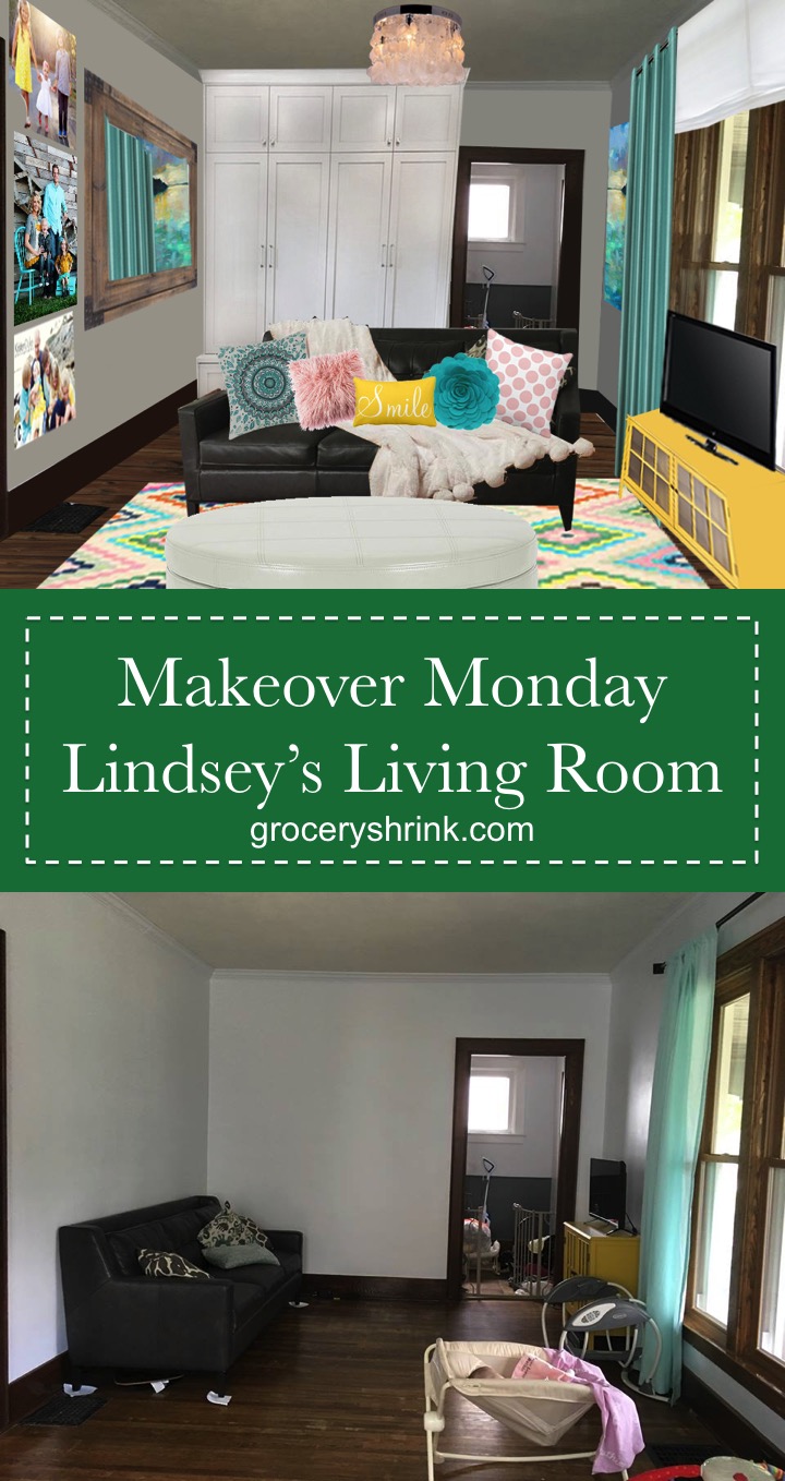
On the entry side of the room, I built her a mudroom locker system with doors that close completely so you don’t see any clutter from the living room side. I added a landscape print where her TV used to be with accents of blue in it to coordinate with her curtains. A large mirror on the opposite wall gives you a space to check yourself before leaving the house, but even better it visibly widens the narrow room. By reflecting the landscape print on the opposite side, subconsciously we register the mirror as a window.

I used a playful rug to ground the seating are. It’s large enough (8×10) that all the legs of the furniture can rest on it. This print is from RugsUsa and reminds me of a modern granny square afghan. I love how it brjngs together the yellow and turquoise from her curtains and console while bringing in some of the mid-century modern feel from her design boards. To added texture I brought in a pom pom accent throw and throw pillows. And a plush round storage ottoman to hold extra blankets and extra seating and no dangerous corners.
For additional art I used family pictures taken in outfits that compliment her color scheme. When you hang your curtains high and wide, not only does the window look bigger and the ceilings taller, but you don’t need as much art, win-win-win.
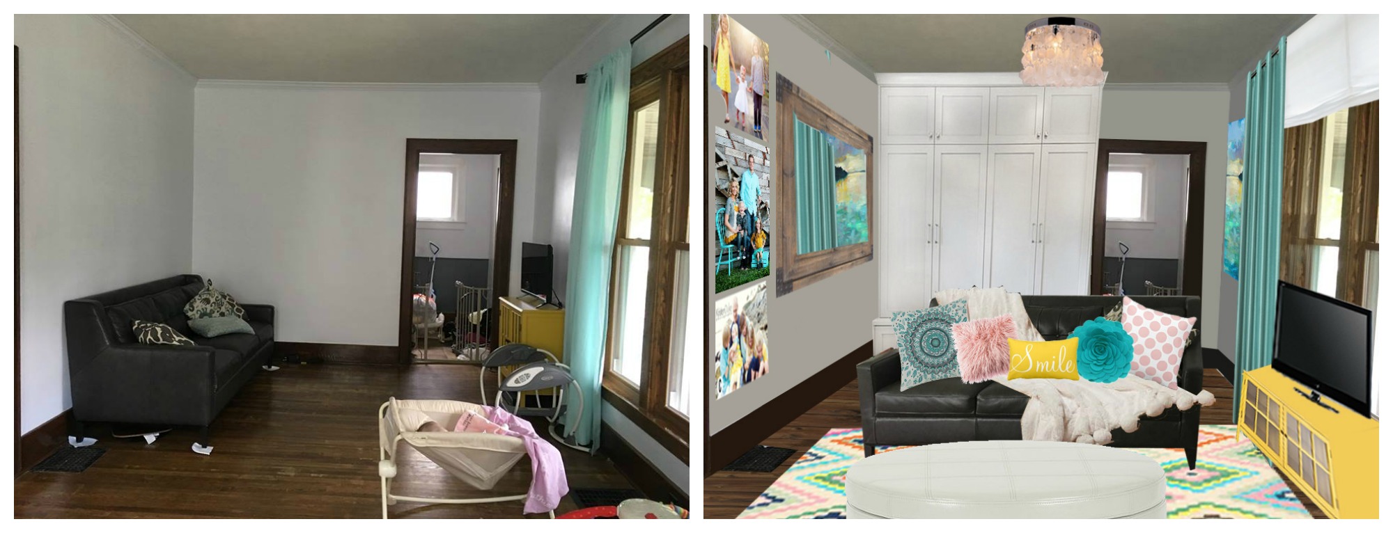
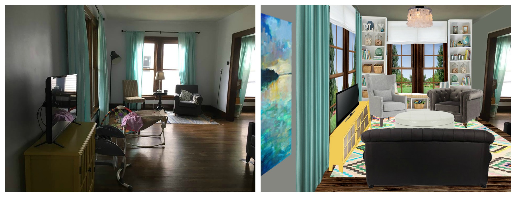
Just for giggles, here are some side by side before and afters.
Sources:
Art (this is the source i got it from but I had trouble nailing it down after that.)
This post contains Amazon affiliate links :).
Yay!! Thank you, Angela!! This is so fun and is making us think about the room totally differently than we were. I would have never thought to add all those built ins.
Thank you for taking the time to help us think through this!
It was fun for me too and a BIG challenge. The built ins will help the room feel shorter, but you don’t have to do them on the window side if you just pull the sofa away from the wall a bit. You can float a console table behind it with lamps (and still have room to walk behind) to bring the furniture more towards the center of the wide cased opening.
Before looking at your suggested changes, I was going to suggest putting the couch similar to what you did. I am doing that in my current home as well as the previous house. It basically makes 2 ‘room’s in the one space. In previous house I had put my bookcases in an L shape in the corner across from the front door. Behind the couch I had my student desk that I use for sewing. Under the double windows I had a bench that held my houseplants. It wasn’t a big area but big enough for what I needed to do there.
In my new place the couch divides the living room area and the dining area. The only space for the bookcases is in the corner of the dining area and it works, especially since I work on preparing Bible studies on the dining table.
So I think your plan looks very nice. It does not hurt to have either the couch or the chairs partially in front of the wide doorway since there is still plenty of room to enter and for traffic pattern. Good job!
I forgot to mention that I use nice wooden tray tables that fold up for an end table next to couch and chair. I got mine at Walmart and is an inexpensive way to add tables for lamps, etc. Right now I only have one up and others stored in the coat closet in case more are needed once in awhile.
I like it! Great floor plan! We used to have a similar room, long and narrow with lots of windows and door ways. Great job!
It looks so bright and fun. I love all the the color!! Where did you find the landscape pic? I’m in the hunt for artwork and it is beautiful. You do such nice work!
Thank you, CJ. I searched for “turquoise landscape painting” on Pinterest :). You can search like that for any type of art and color scheme then click through to buy.
This looks great, so bright and cozy.