When Nicci sent me the before photos of her living room I was blown away with the great bones of the space. 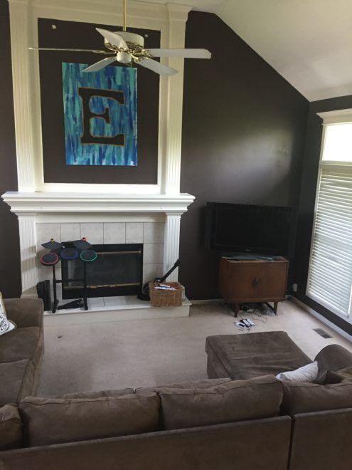
It has a tall vaulted ceiling, a big centered fireplace, and is flanked on both sides with floor to ceiling windows. So much light!
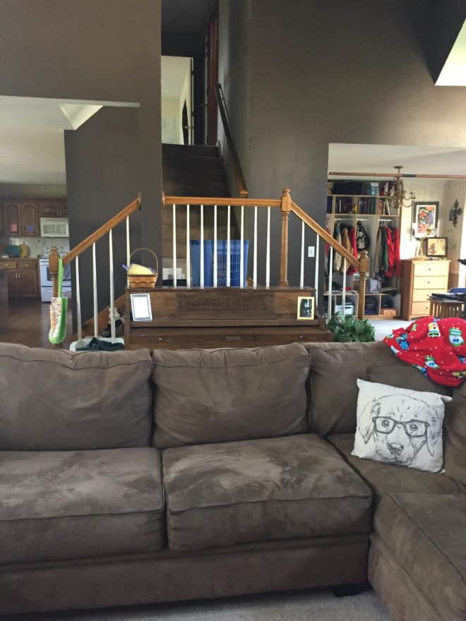
The semi-open floor plan looks into her kitchen and eating area to the left, and a work area with locker storage to the right that is right near the front door. Stairs in the center lead to the bedrooms.
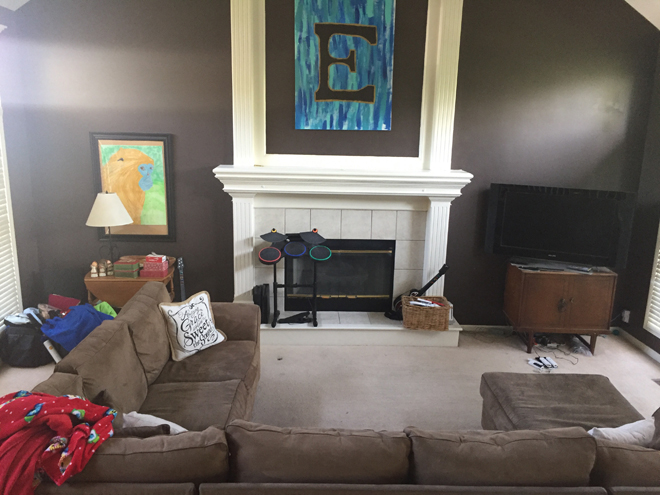
She already had the perfect furniture arrangement for the layout of the space. The room could also support dueling full size sofas and accent chairs, but to keep the budget low, I reused her original pieces. She said they’ve enjoyed their paint color but are are ready for something new. She wasn’t sure if gray was too close to the end of it’s trend life to invest in painting such a big area and wondered if she should dismantle and redo the fireplace completely. She sent me her pinterest board of ideas and it was modern farmhouse style with planked walls and neutral colors. Like these:
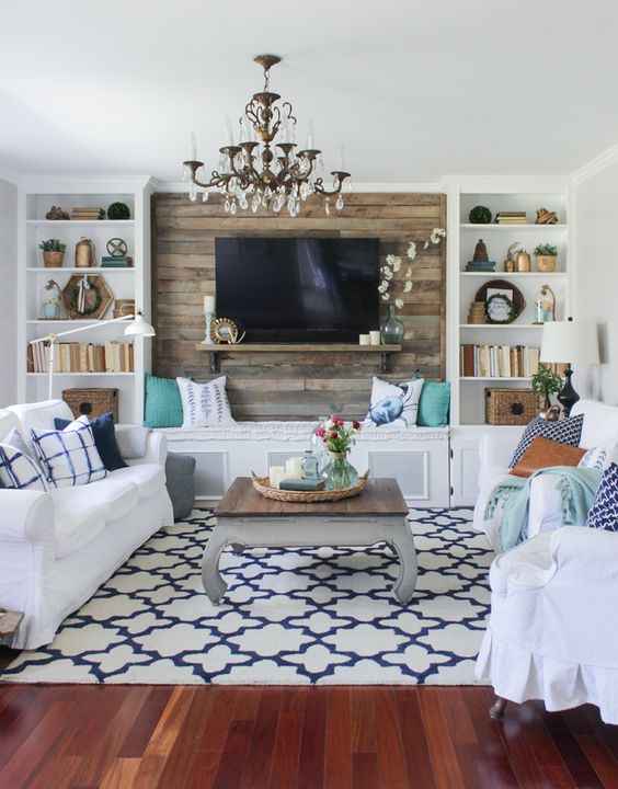
http://www.shadesofblueinteriors.com/cozy-spring-home-tour/
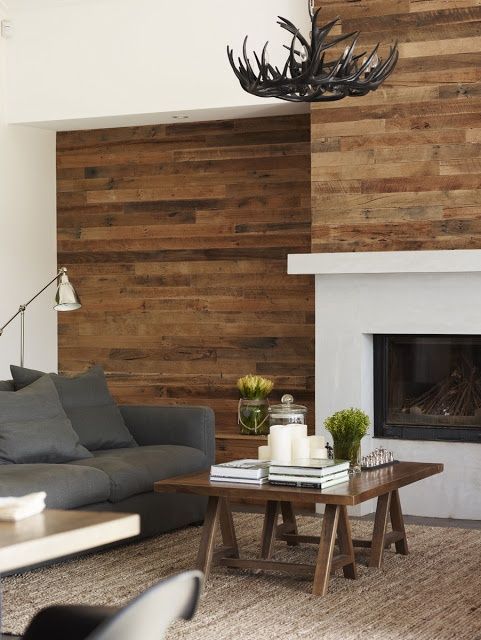
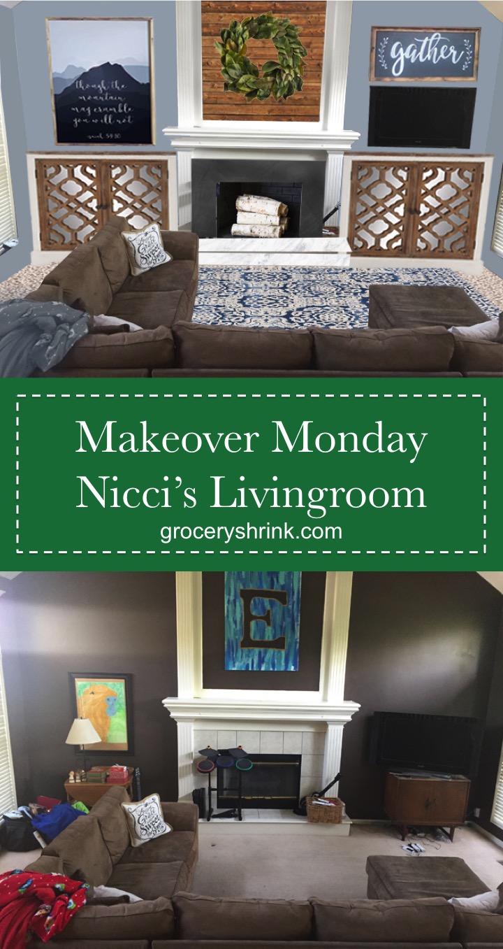
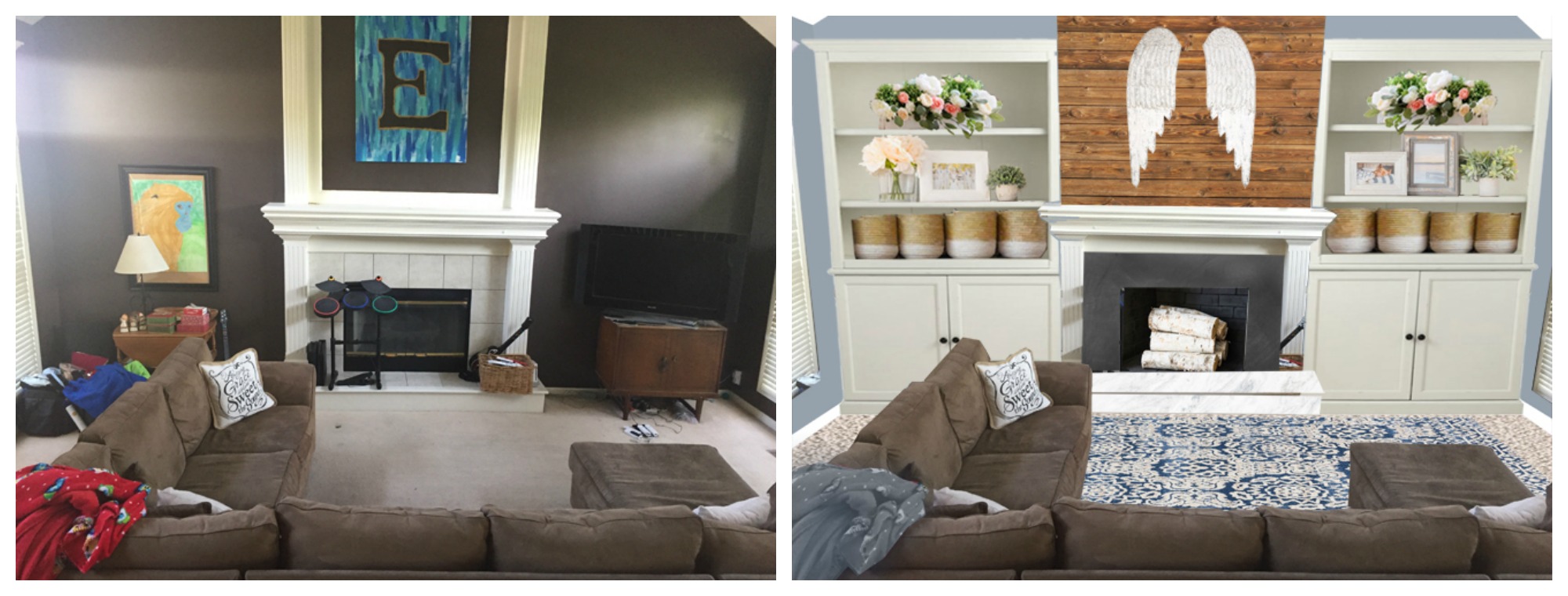
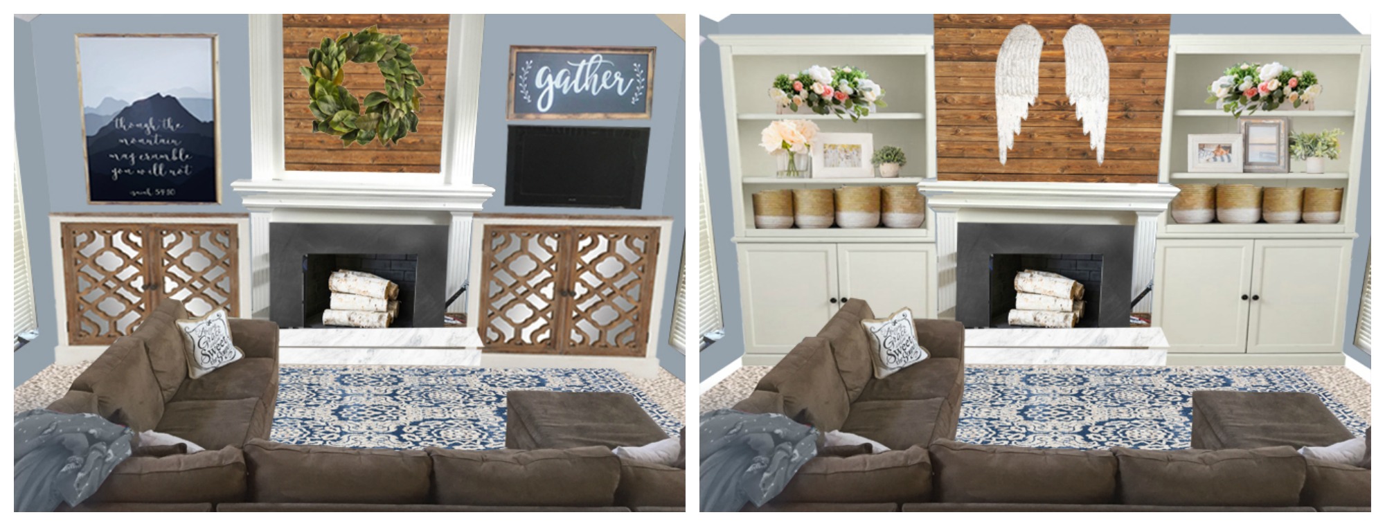
She was very interest in doing built ins on each side of the fireplace. So I did one photo showing her how that would look if she took down the upper columns on the fireplace and planked the wall instead. I put in custom built-ins and styled the shelves for her with color pops of salmony pink. The TV would hide in the doored lower section on the right.
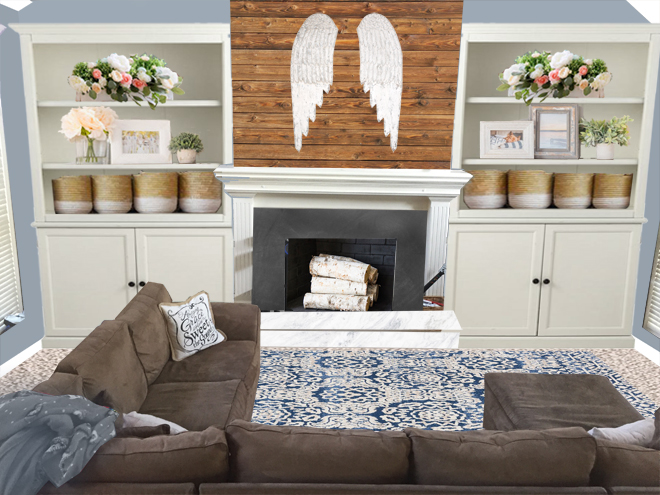
I also pulled out her fireplace insert and painted the inside with heat proof black paint. Then covered her hearth tile with Chalk Board Contact Paperas seen on The Nesting Place here and here. She can leave it seasoned, or change the pattern to suit her fancy. There’s Marble Vinyl Paper
on her hearth step. If she likes the look, she can make it more permanent later by looking for marble slab leftovers at Habitat Restore. I chose Benjamin Moore’s New Hope Gray for her paint color. It’s gray with undertones of blue which keeps it from feeling too industrial. It’s a medium color but pairs nicely with her gray/brown sectional and is lighter than her current paint.
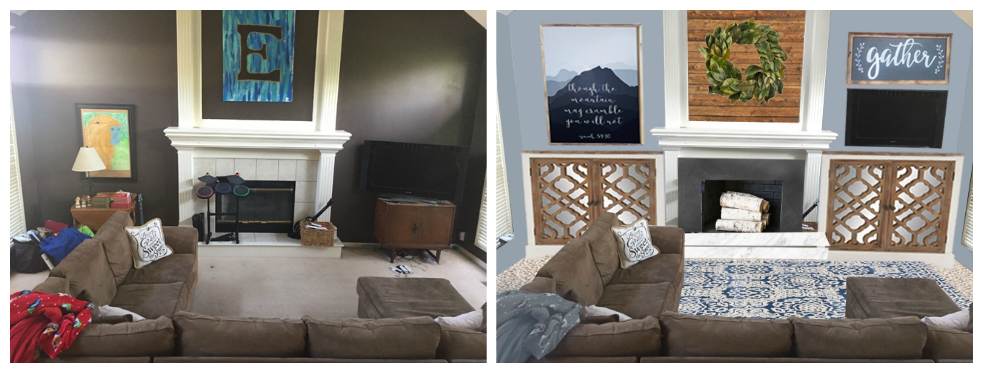
After looking at the picture for awhile, I started thinking about how much work it would be to demolish the fireplace. To make the builtins work she’d also have to redo the whole mantle area and somehow scribe fill the gap between the built ins and the hearth. It’s possible, but enough tricky and expensive that it might not ever happen. So I made her a 2nd option, where she just filled the central panel of the upper fireplace with planks. And purchased matching cabinets for the lower area. I hung her TV on the wall and then used art on both sides to make it look like part of an art installment.
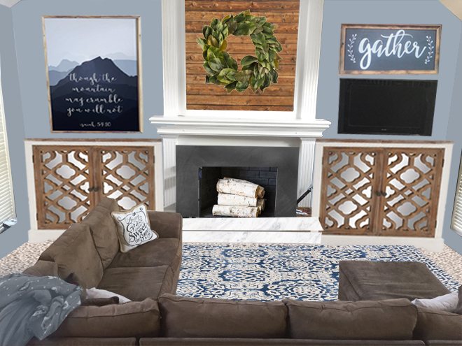
Here’s the deal about the gray trend. Nothing is out of style if YOU like it. Gray is a classic neutral and by itself isn’t on or off trend. It’s what you put with it that might look outdated. When gray was first all the rage it was paired with yellow or green, chevron stripes, or just lots of white and other cool neutrals. The more current gray is warmed up with wood tones, greenery, and pops of color, but a well styled room is never “out” even if it’s using elements that were trendy 10 years ago.
P.S. If you wish you were better at making decorating decisions for your own home, there’s something coming on Wednesday that is going to rock your world! I’m so excited to tell you all about it.
Would you like your room photoshopped and featured on Makeover Monday? Send a few photos from your space to angela@groceryshrink.com and tell me your hopes and dreams for the room. It’s free 🙂
